Duration: 4 months
Research Phase: Mandy Hui, Liana Meere An Pham, Michael Rubin, Rebecca Wang
Product Development: Liana Meere
Design Brief
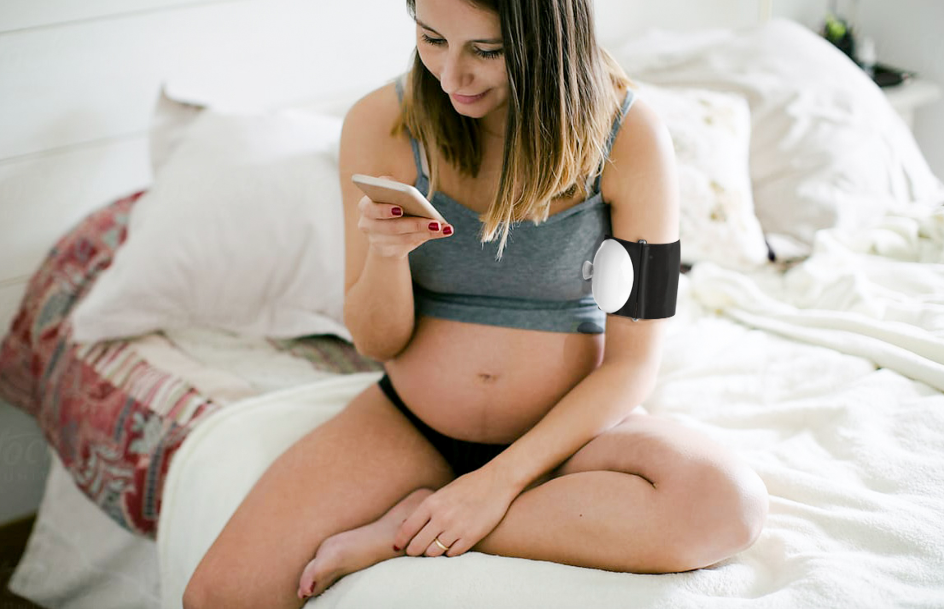
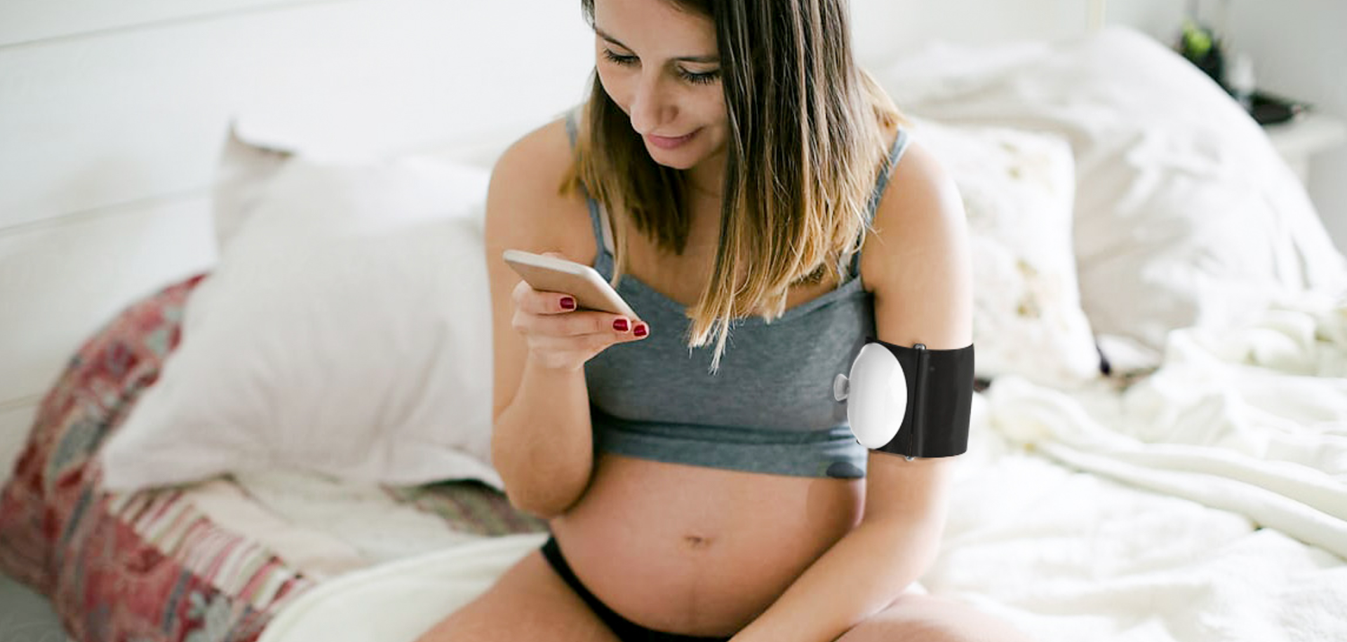
Through research, ideation, and iteration design a portable blood pressure monitor for women with preeclampsia.
Defining the Problem
What is preeclampsia
Preeclampsia is a pregnancy complication marked by high blood pressure and organ damage – which can put the mother’s and baby’s wellbeing at risk.
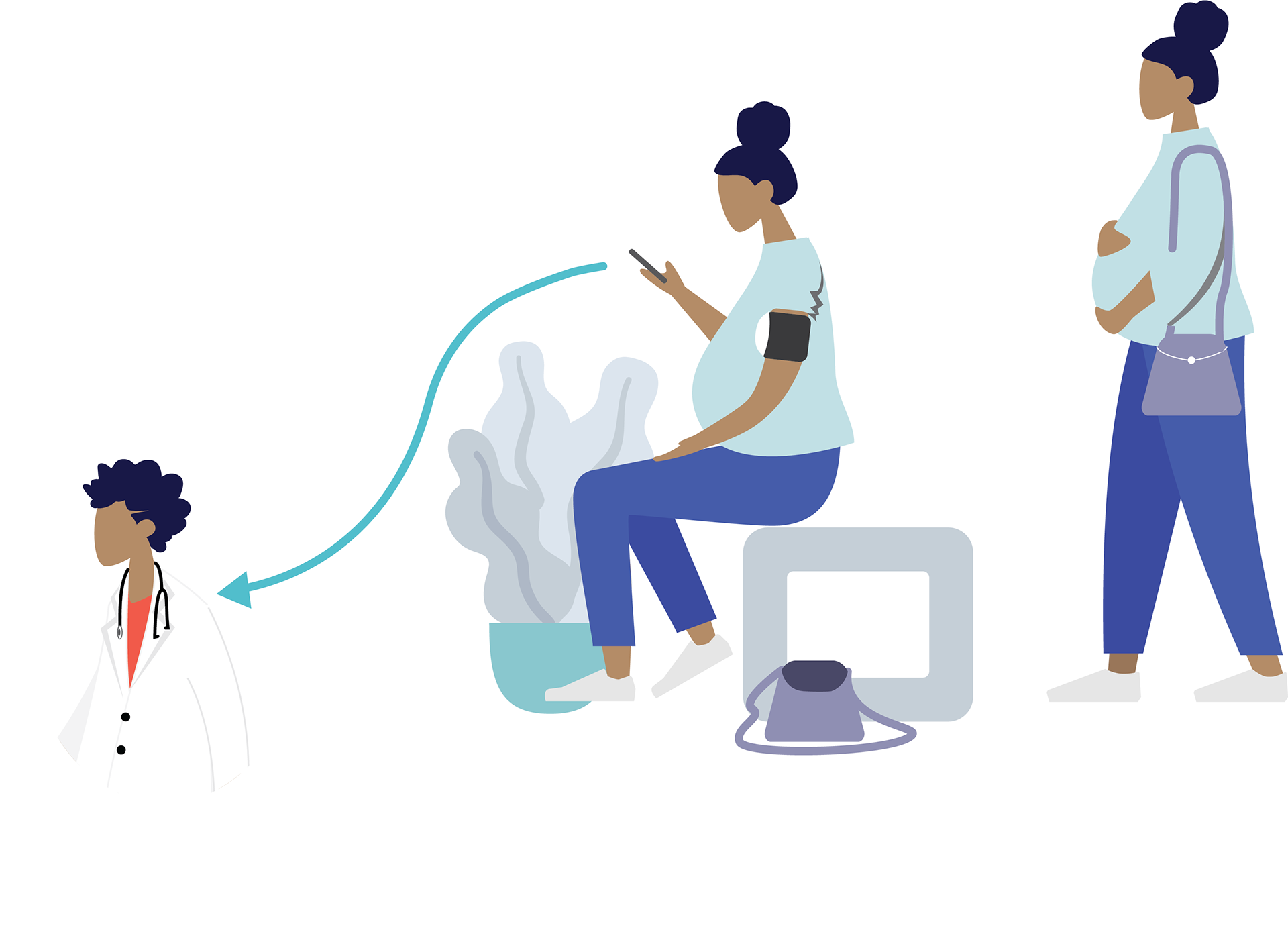
Until she can give birth, she must keep watch of her vitals and be ready to call for help if she detects any anomalies.
They need a direct line of communication with their doctors
Technology & Existing Solutions
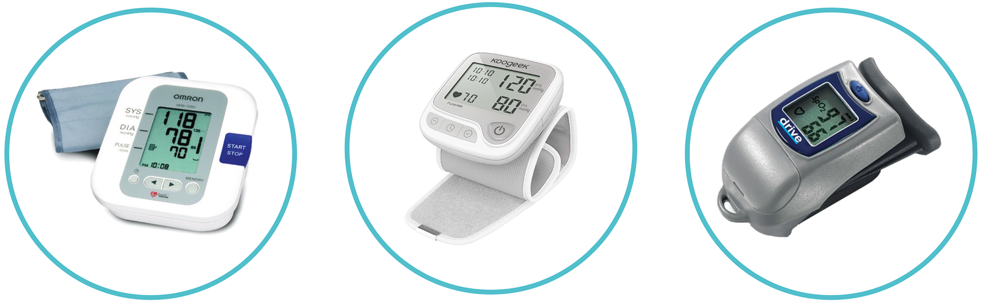
Based on our research into the accuracy and price points of the 3 different types of monitors, I decided to design a bicep monitor (far left). View the full research report here.
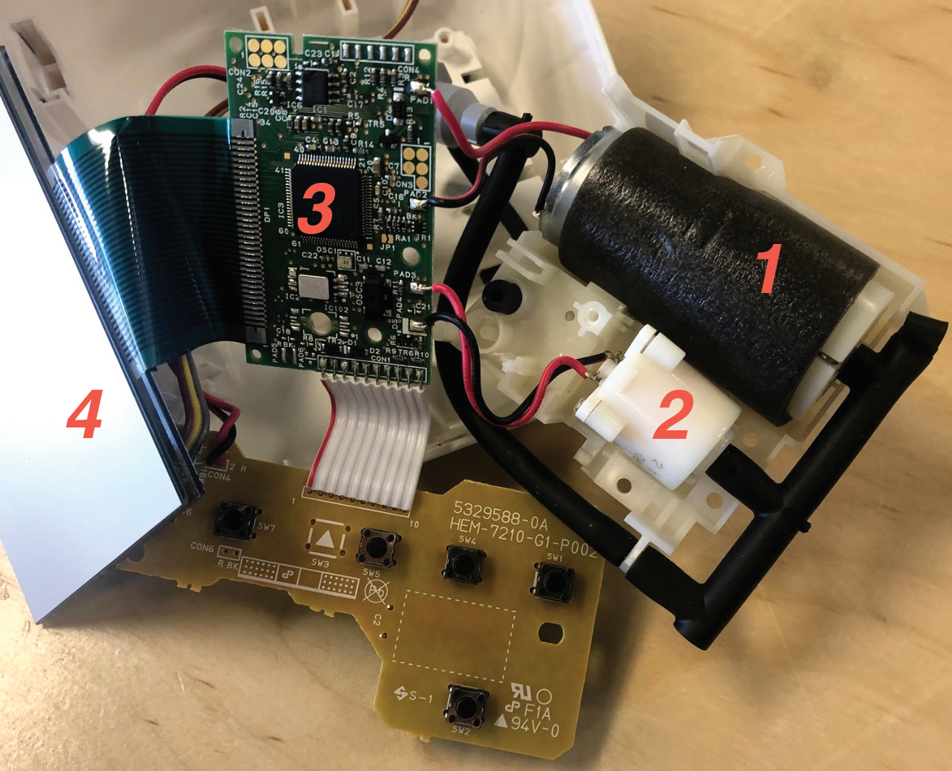
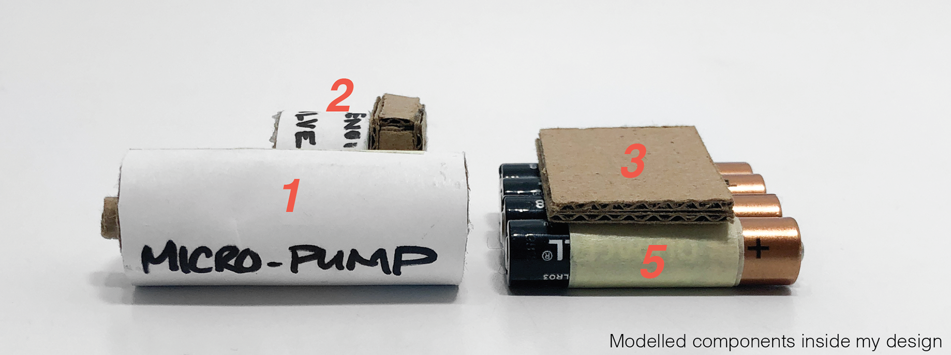
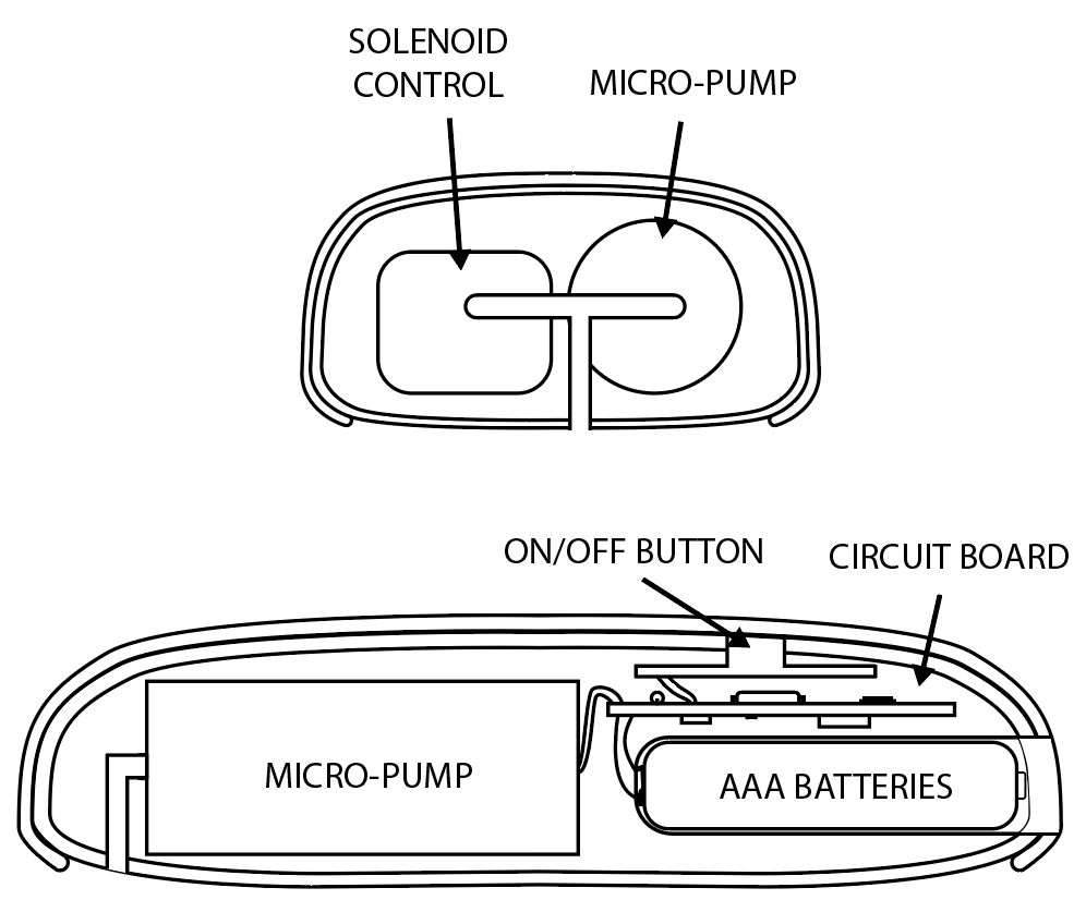
Internal components:
1) Micro-pump - Pressurizes air into the cuff.
2) Solenoid - Controls the air flow from the pump into the cuff.
3) Circuit Board - Holds the main electrical connection and components
4) Screen - Displays data
5) Batteries
Opportunities for Innovation
Concept Development
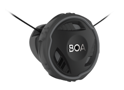
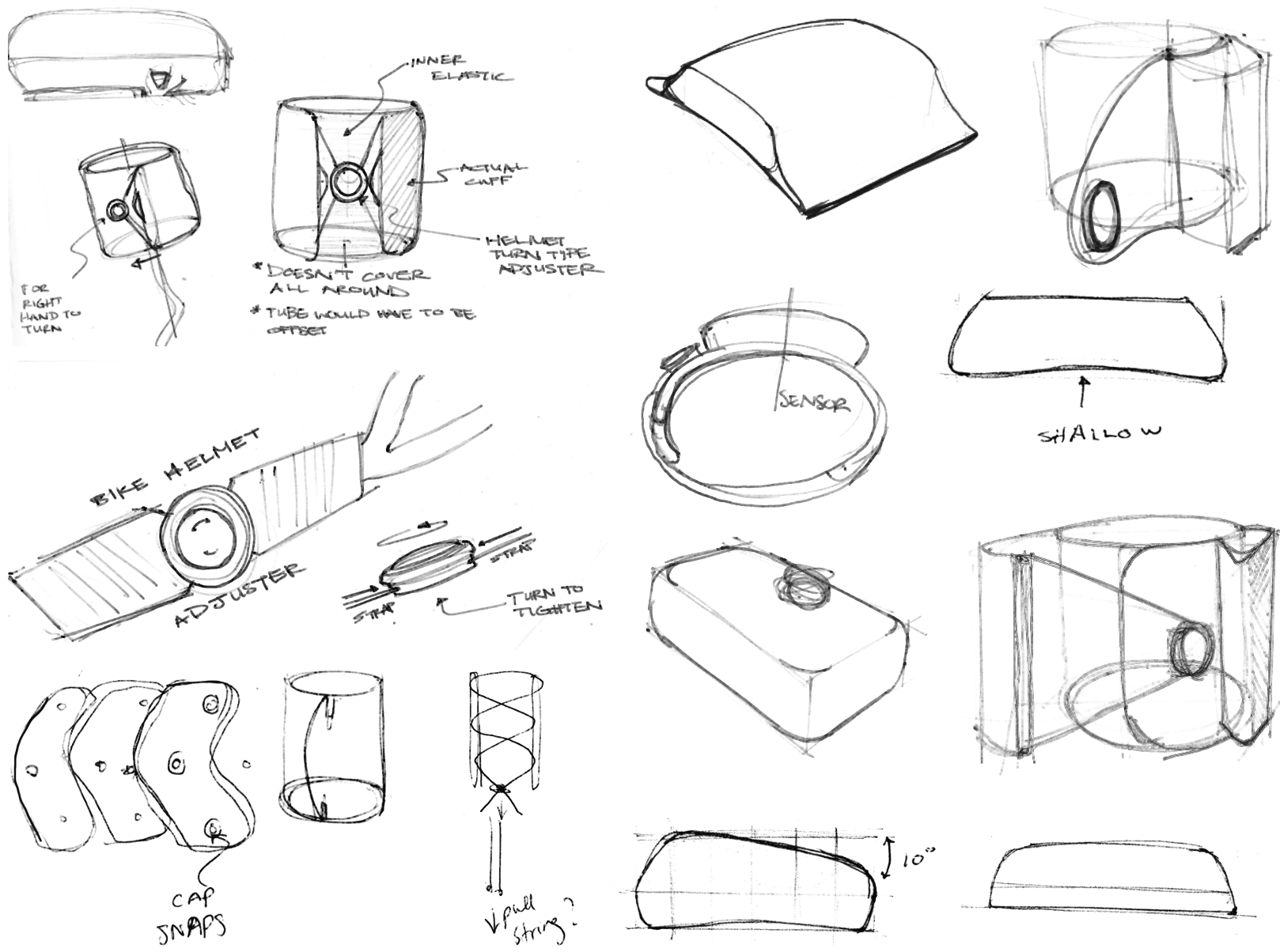
I took inspiration from other types of products and their mechanisms. I considered many adjusters such as those on the back of bike helmets. I decided to use the BOA lacing system often found on ski boots.
Designing the Interface
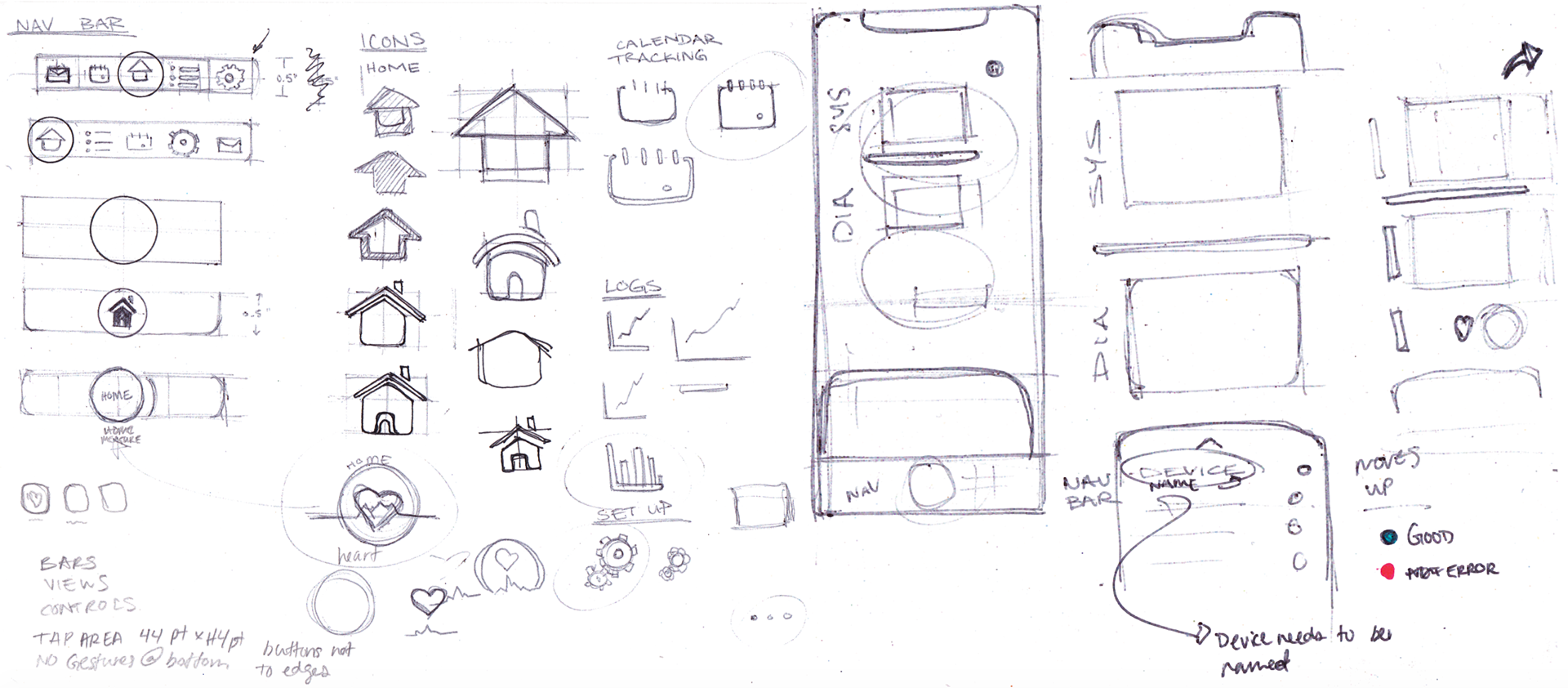
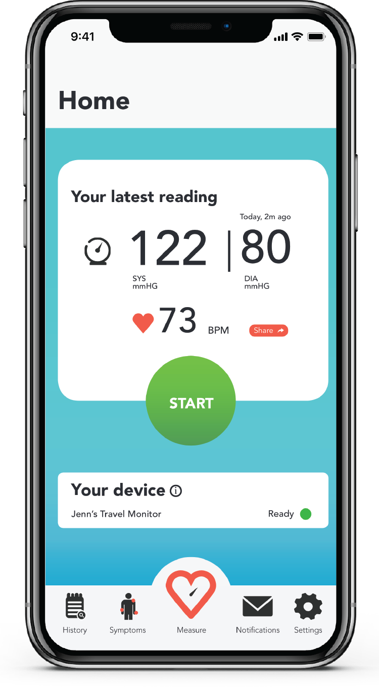
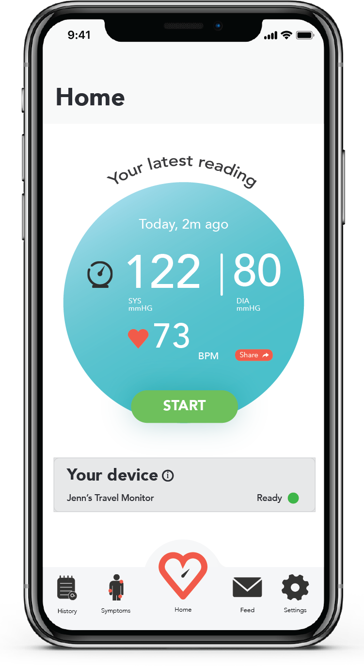
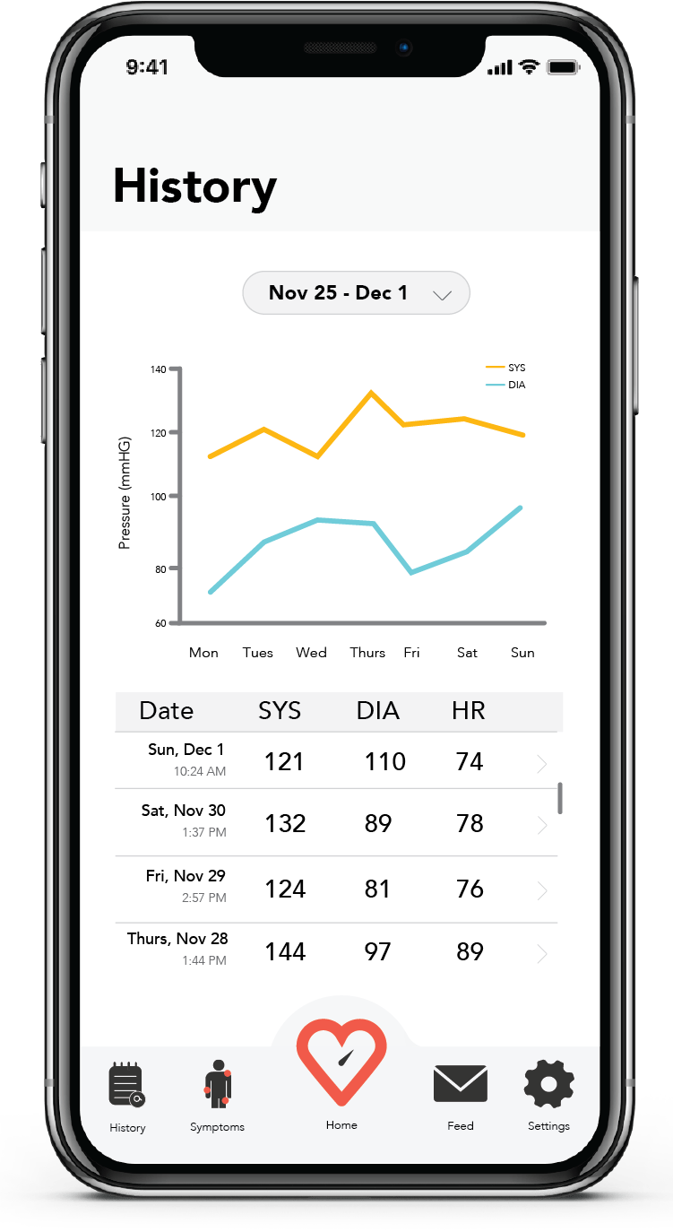
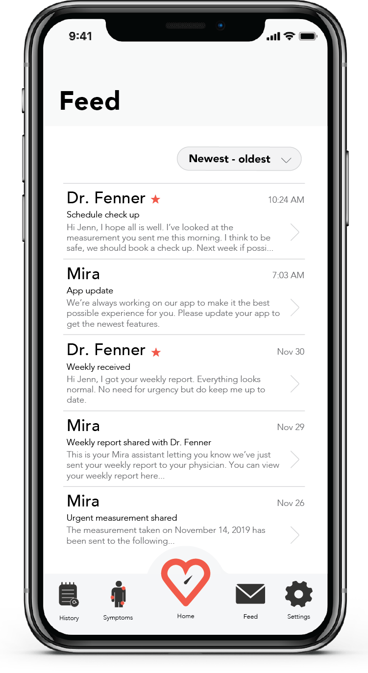
I structured my app as 5 primary pages. Users tap the icon at the bottom of the navigation bar to access the different pages. I decided to focus on the icons and the layout of these pages.
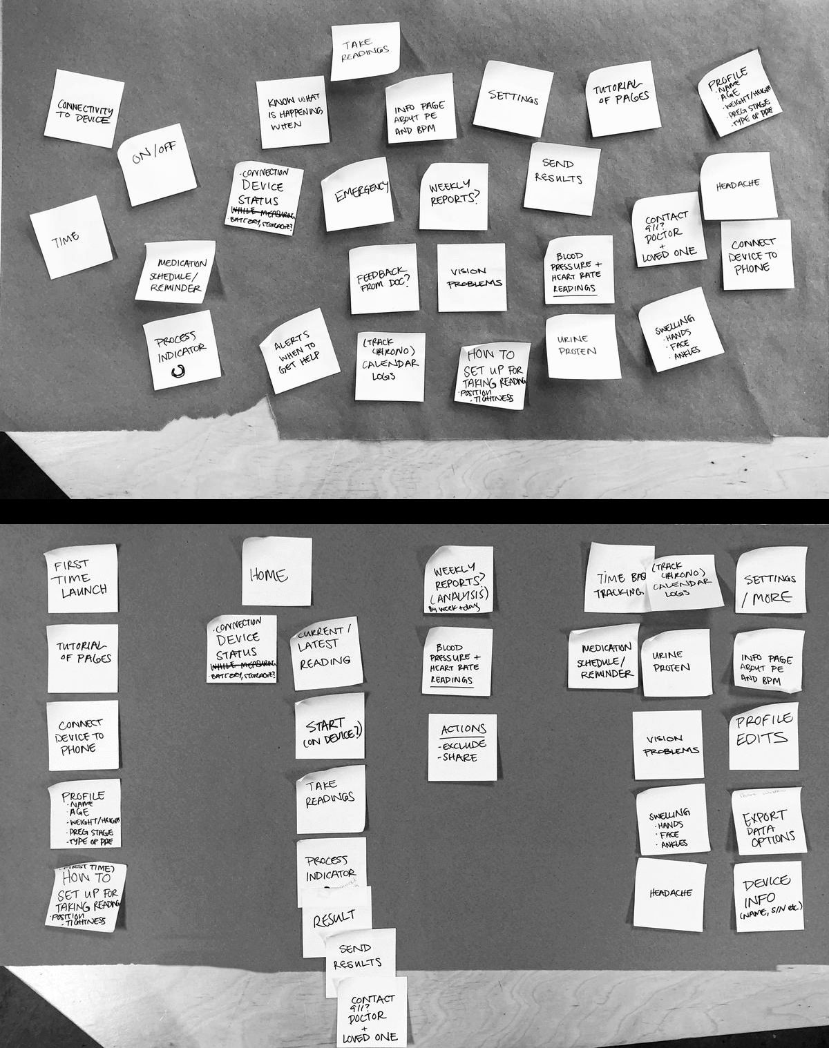
Affinity mapping and organization of app structure
User Testing
What I needed to know:
1. Is the Boa lacing system easy to use in this application?
2. Do users want to display interfaces (on the device and on their phone), or would it be redundant?
3. Is the interface easy to use?
Scenario 1: The monitor device was blank and the controls were on the phone.
Scenario 2: The monitor had a display but the device was still controlled through the phone
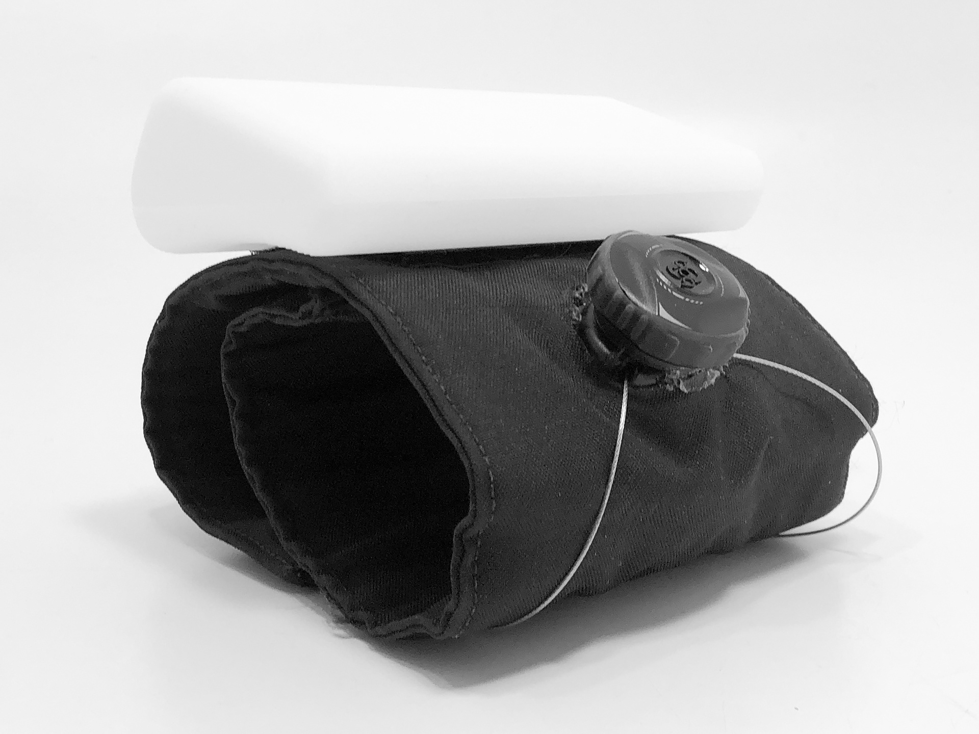
Test model
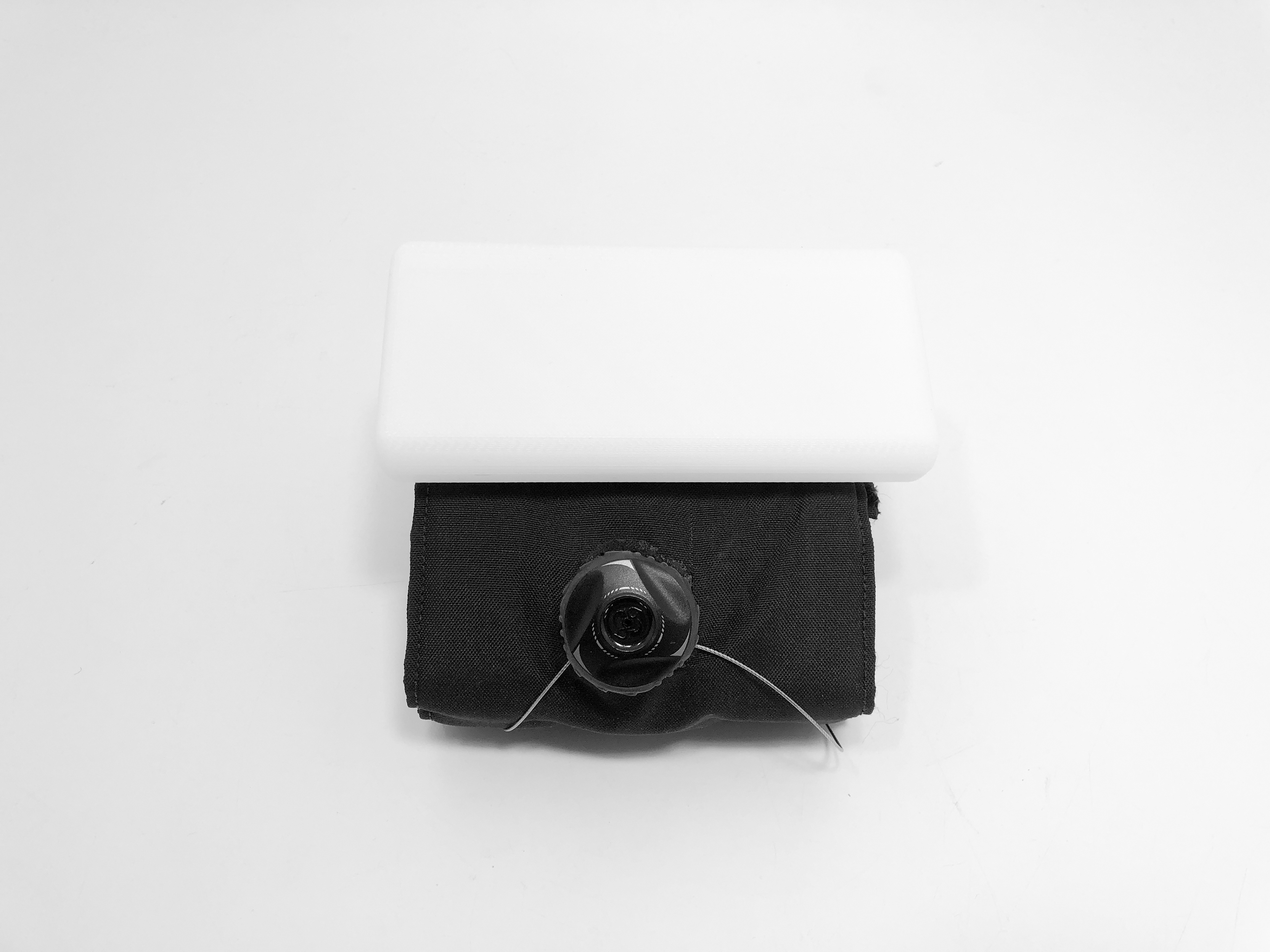
Test model top view
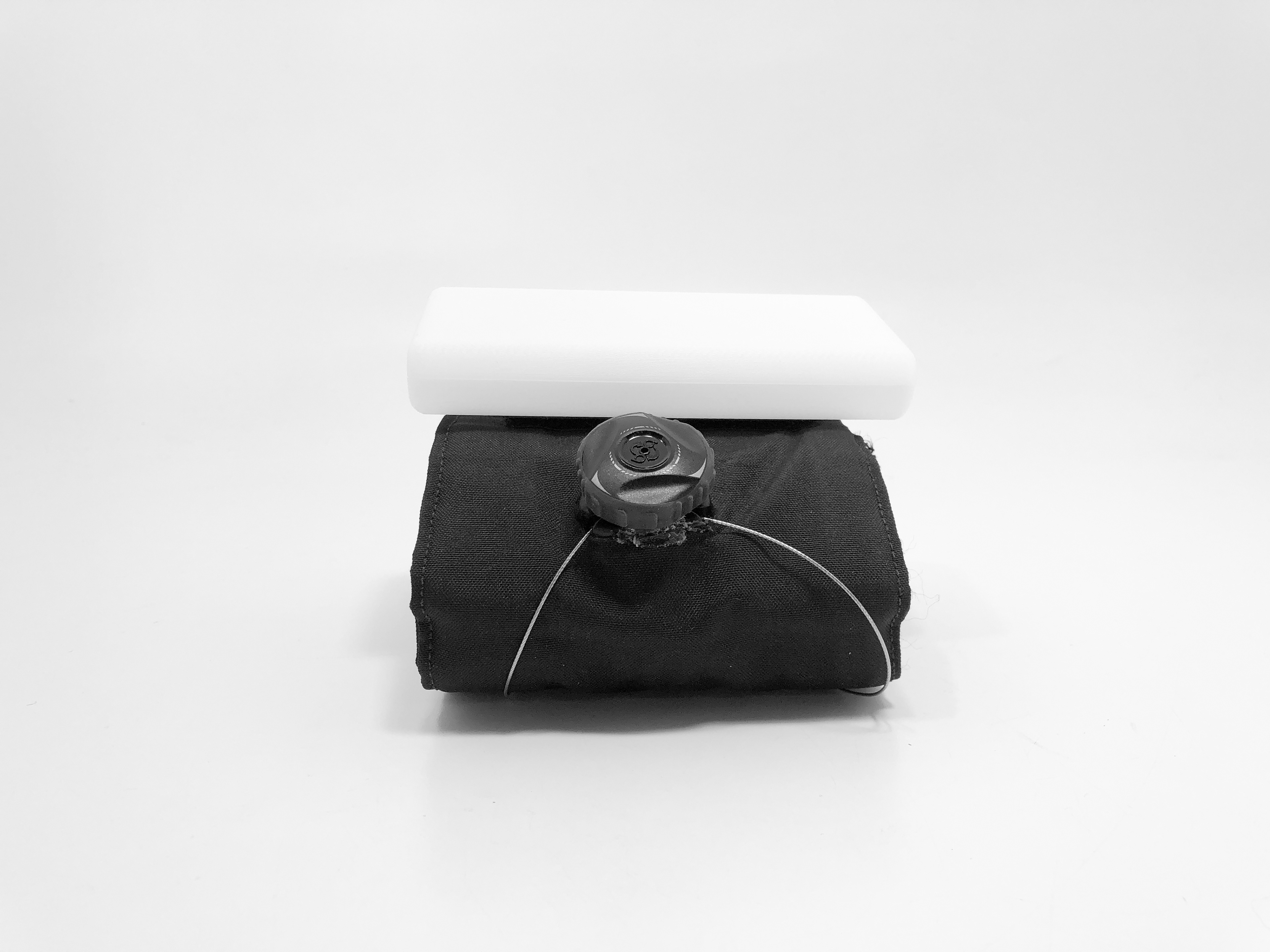
Test model front view
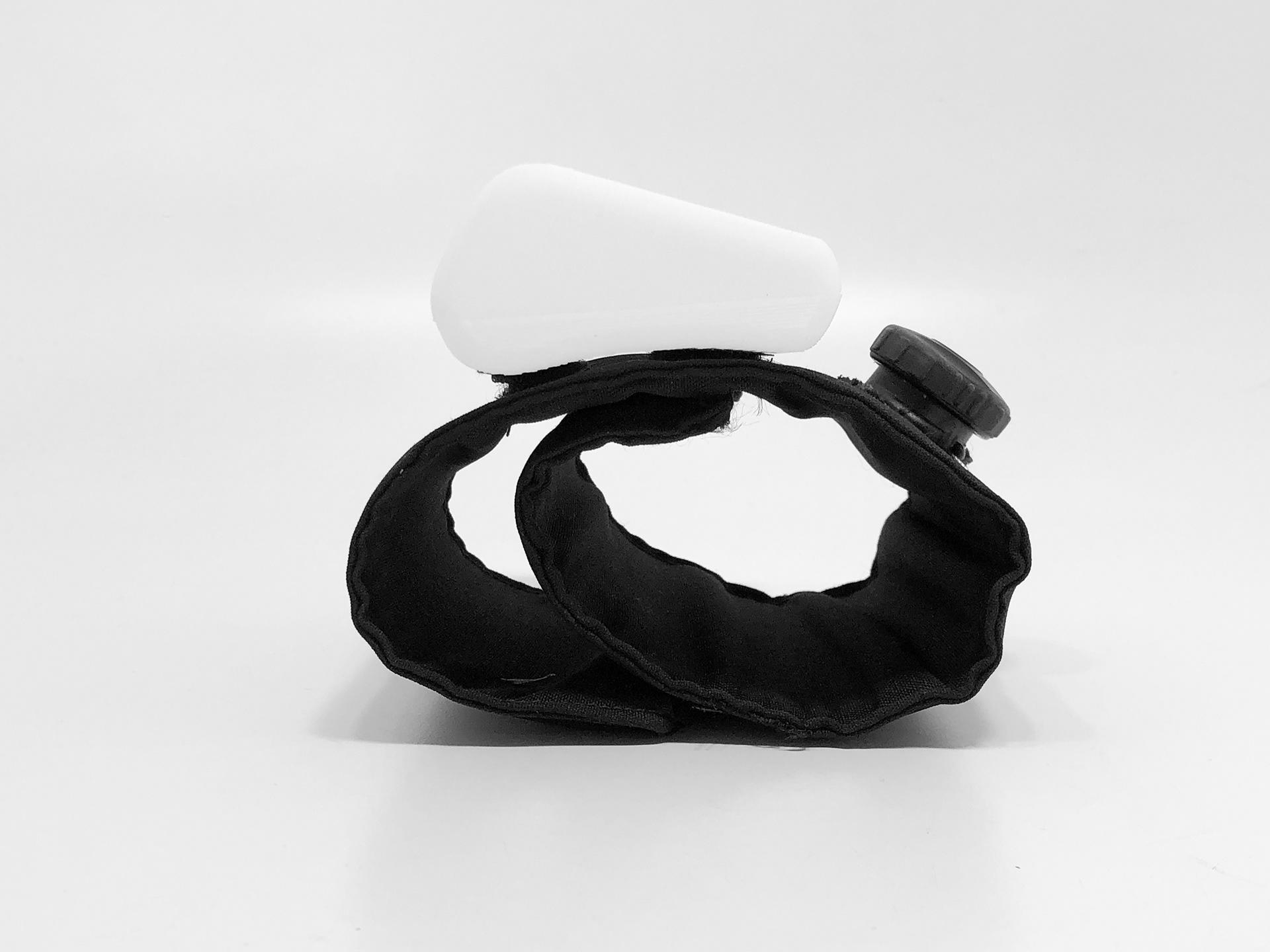
Test model side view
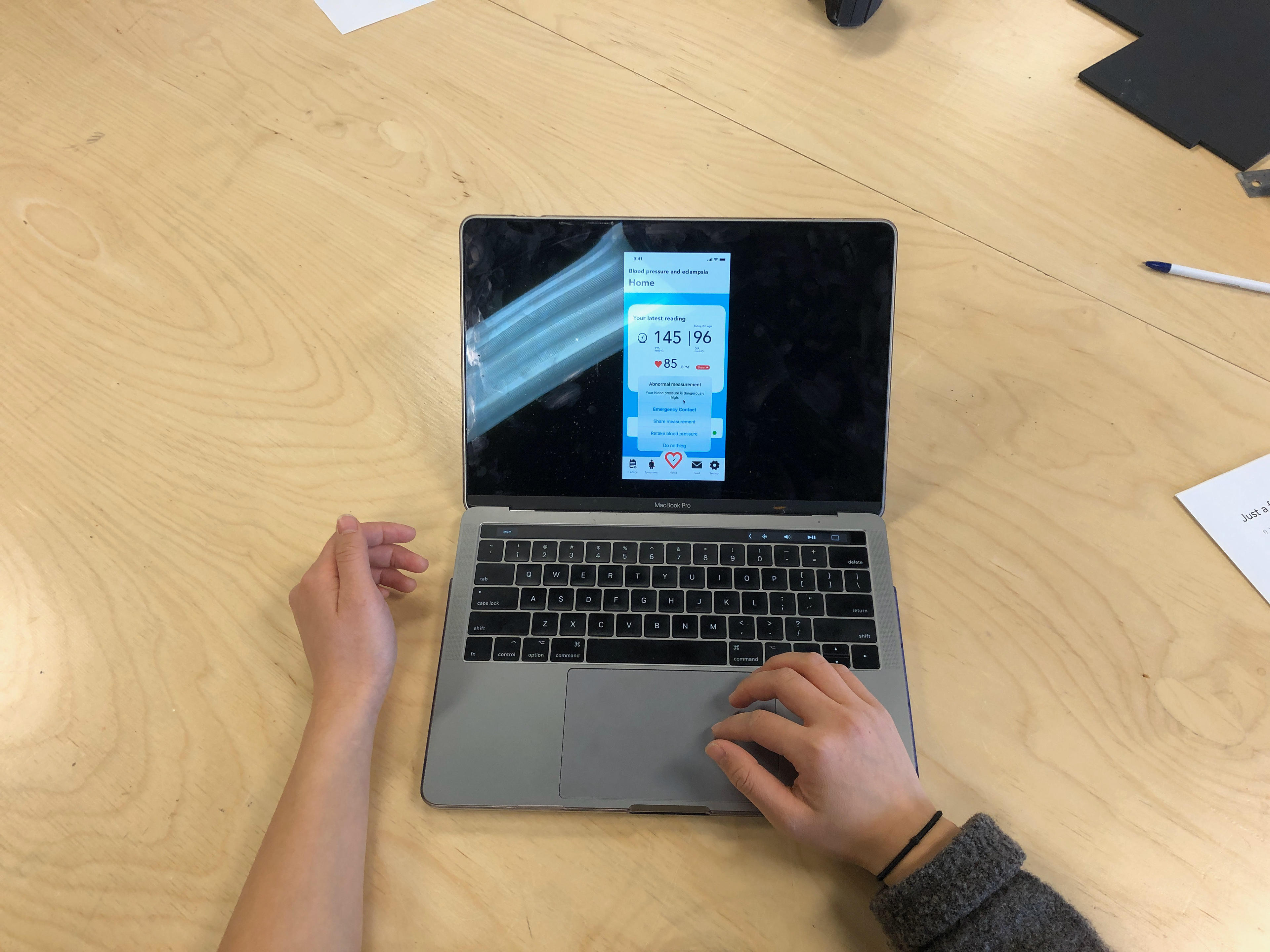
Participant using the interface
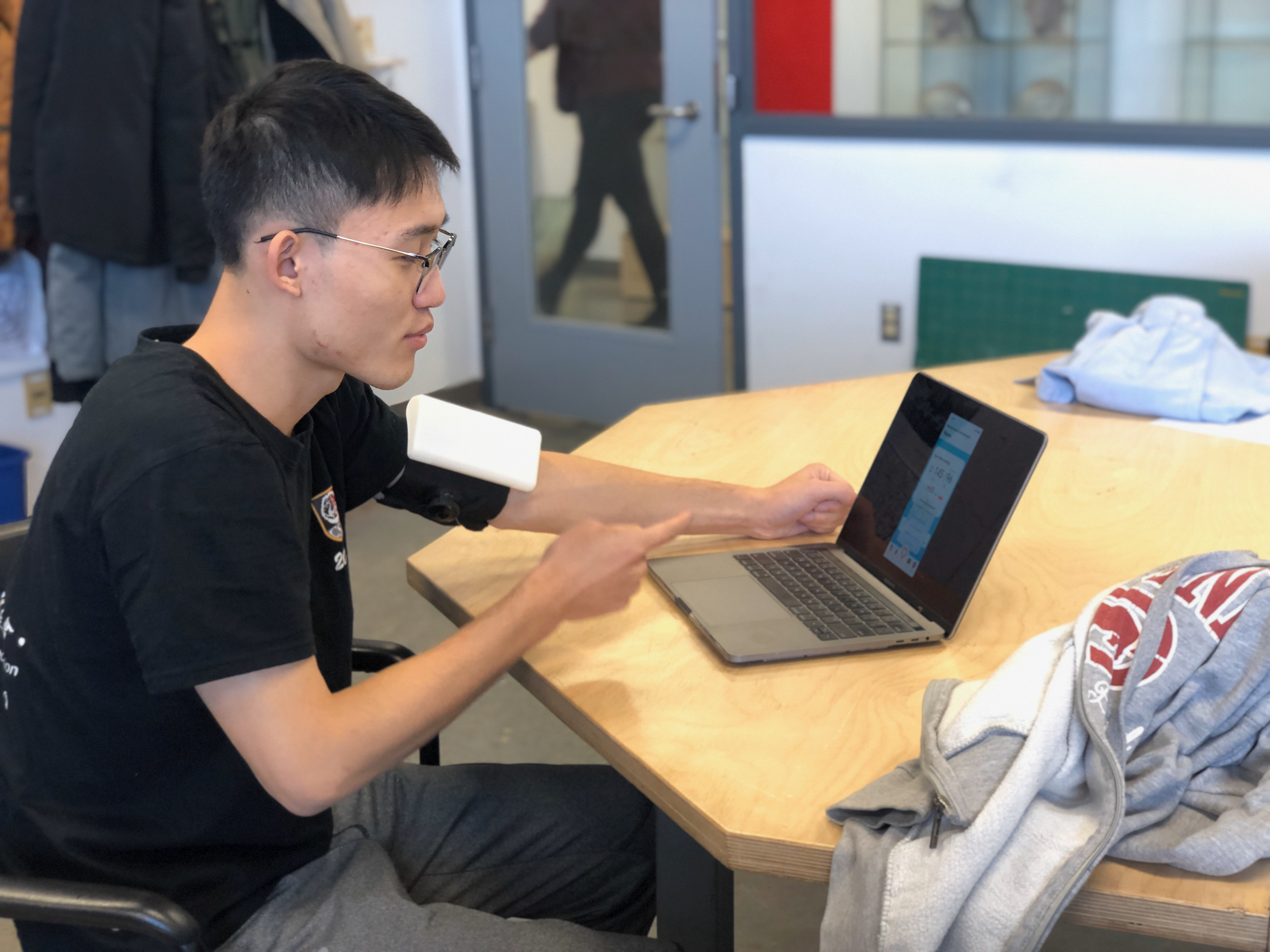
Participant during scenario 1
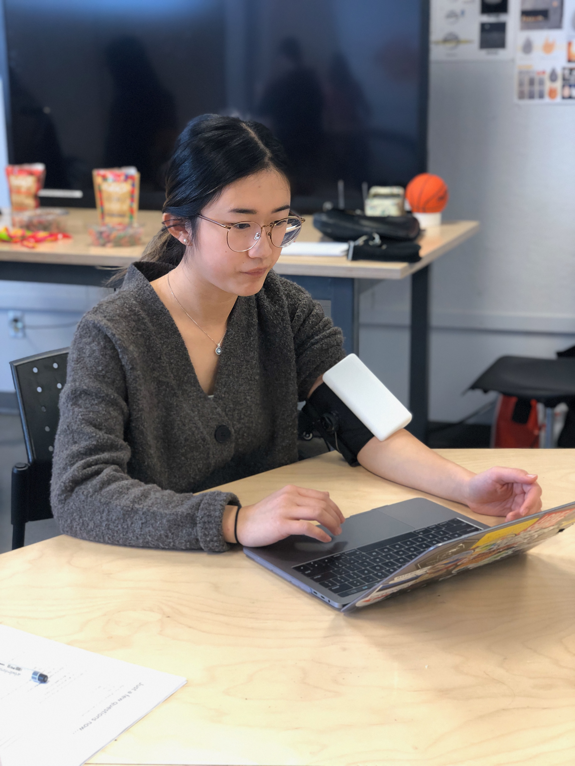
Participant during scenario 1
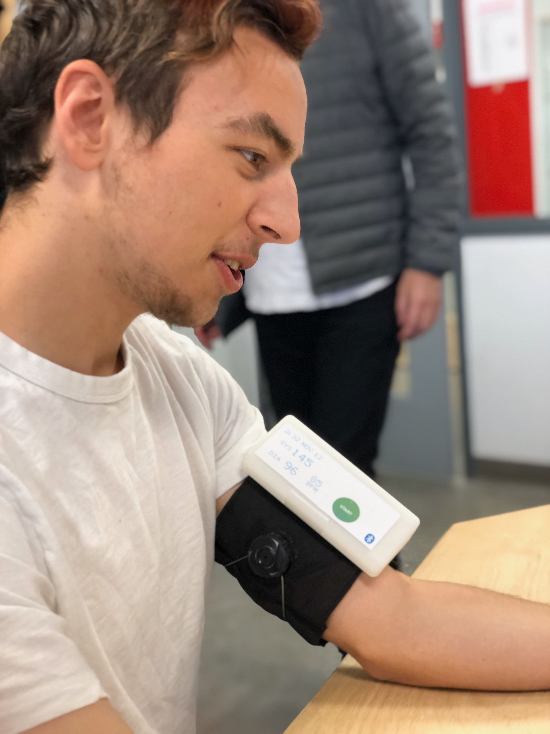
Participant during scenario 2
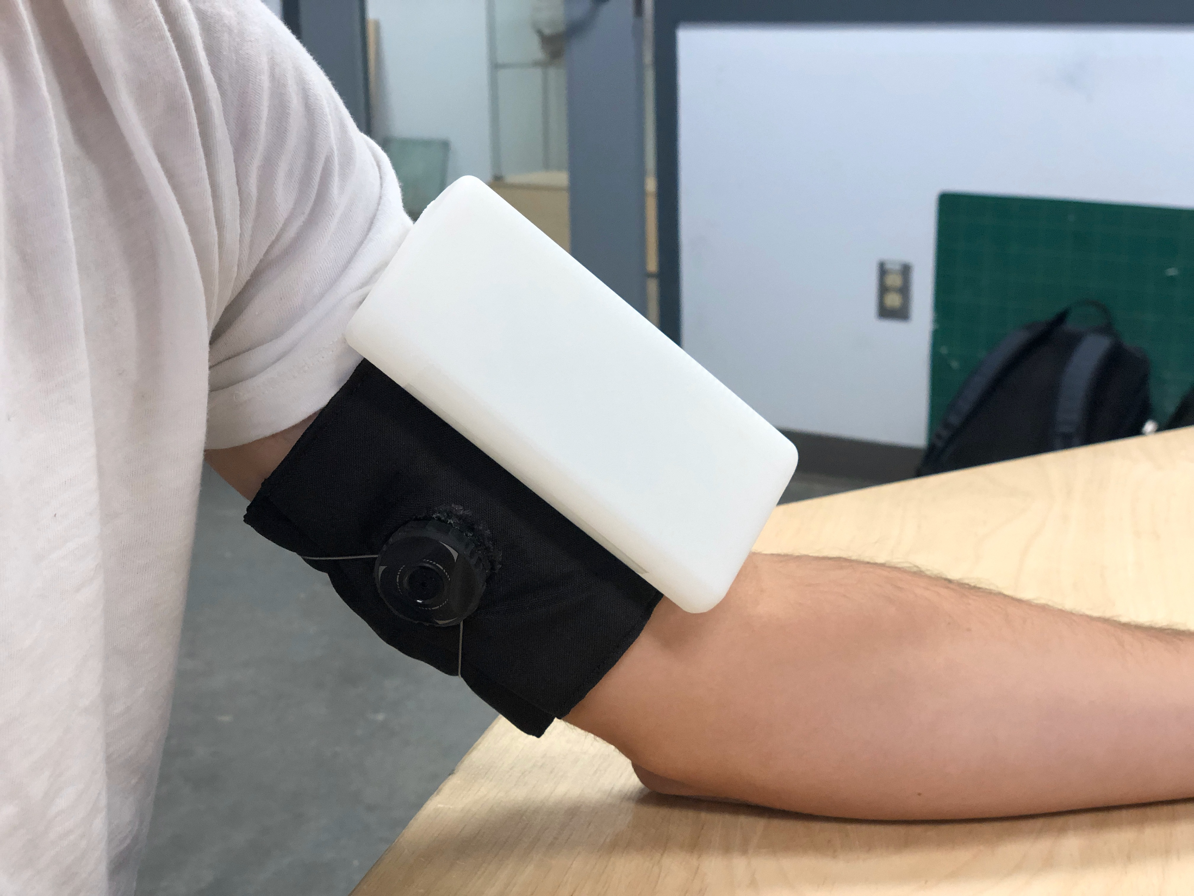
Test model on participant
Interface used by test participants
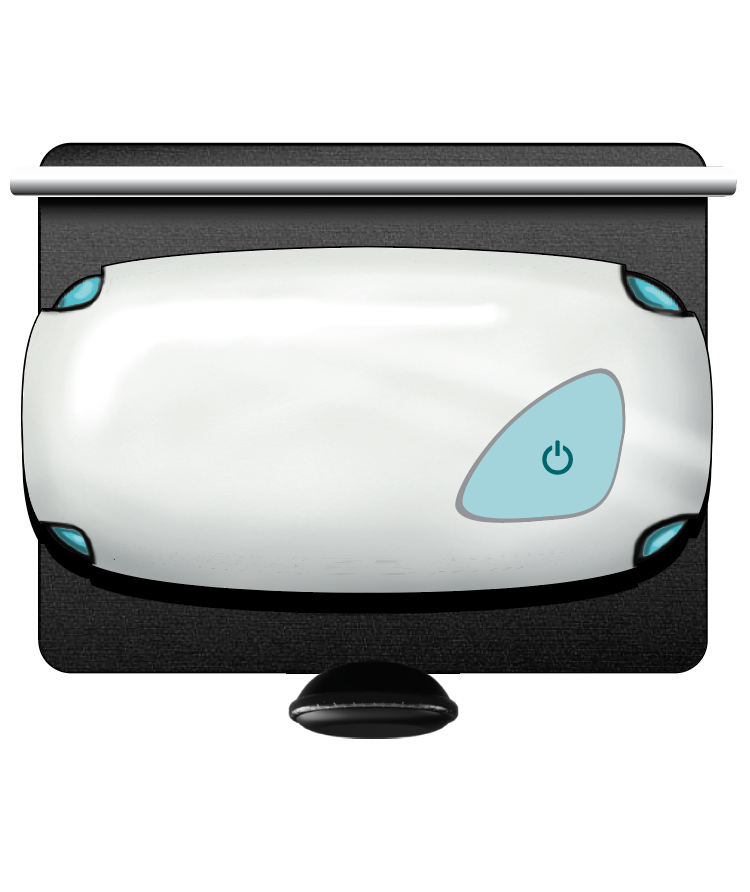
Initial Concept
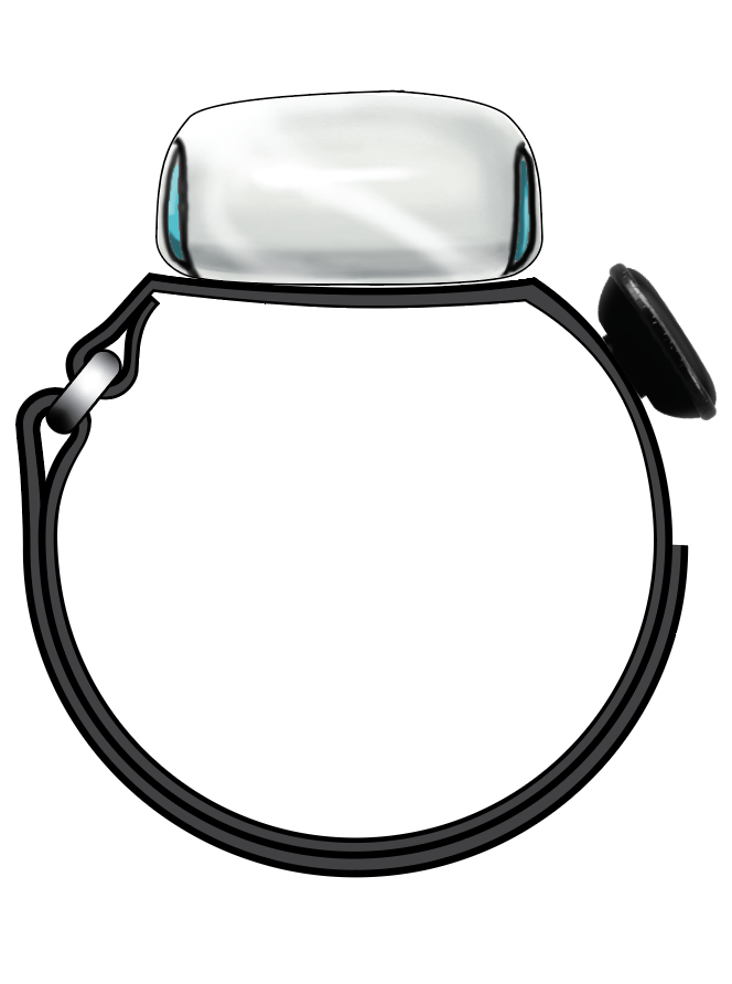
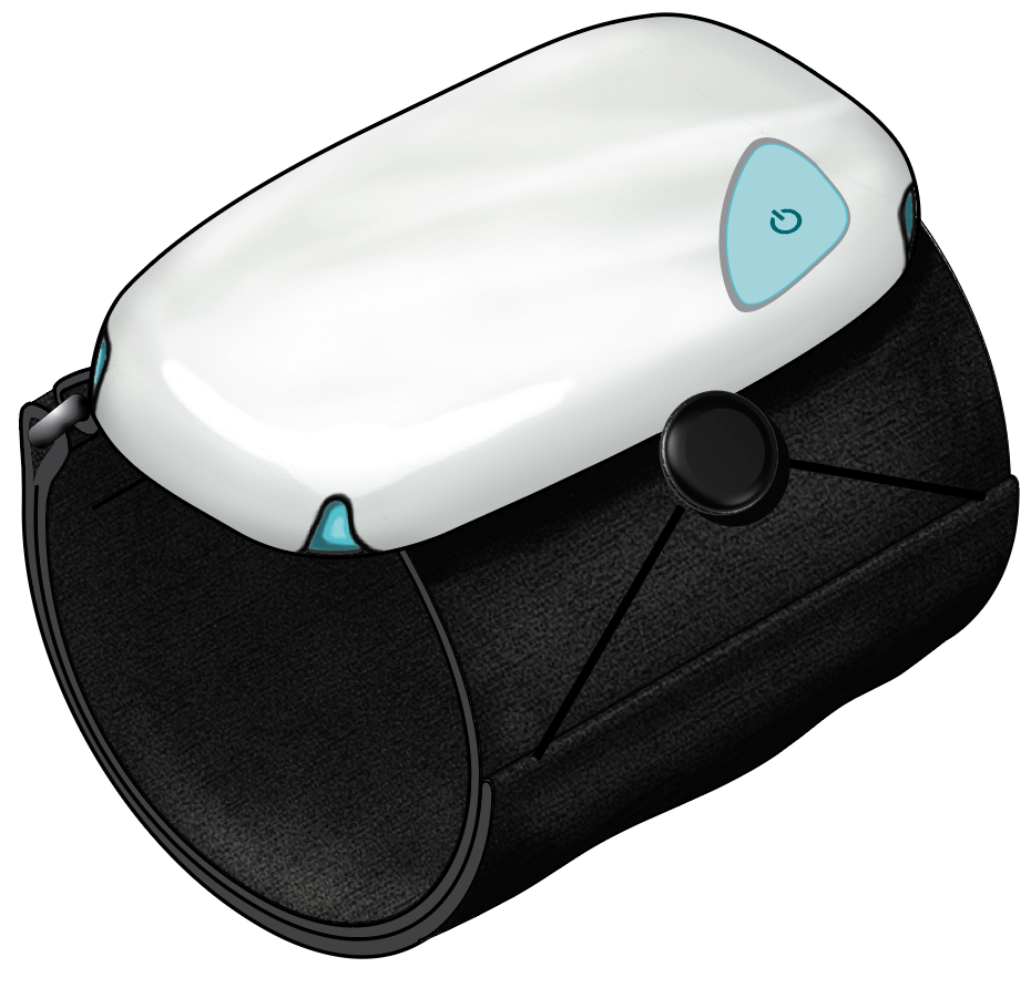
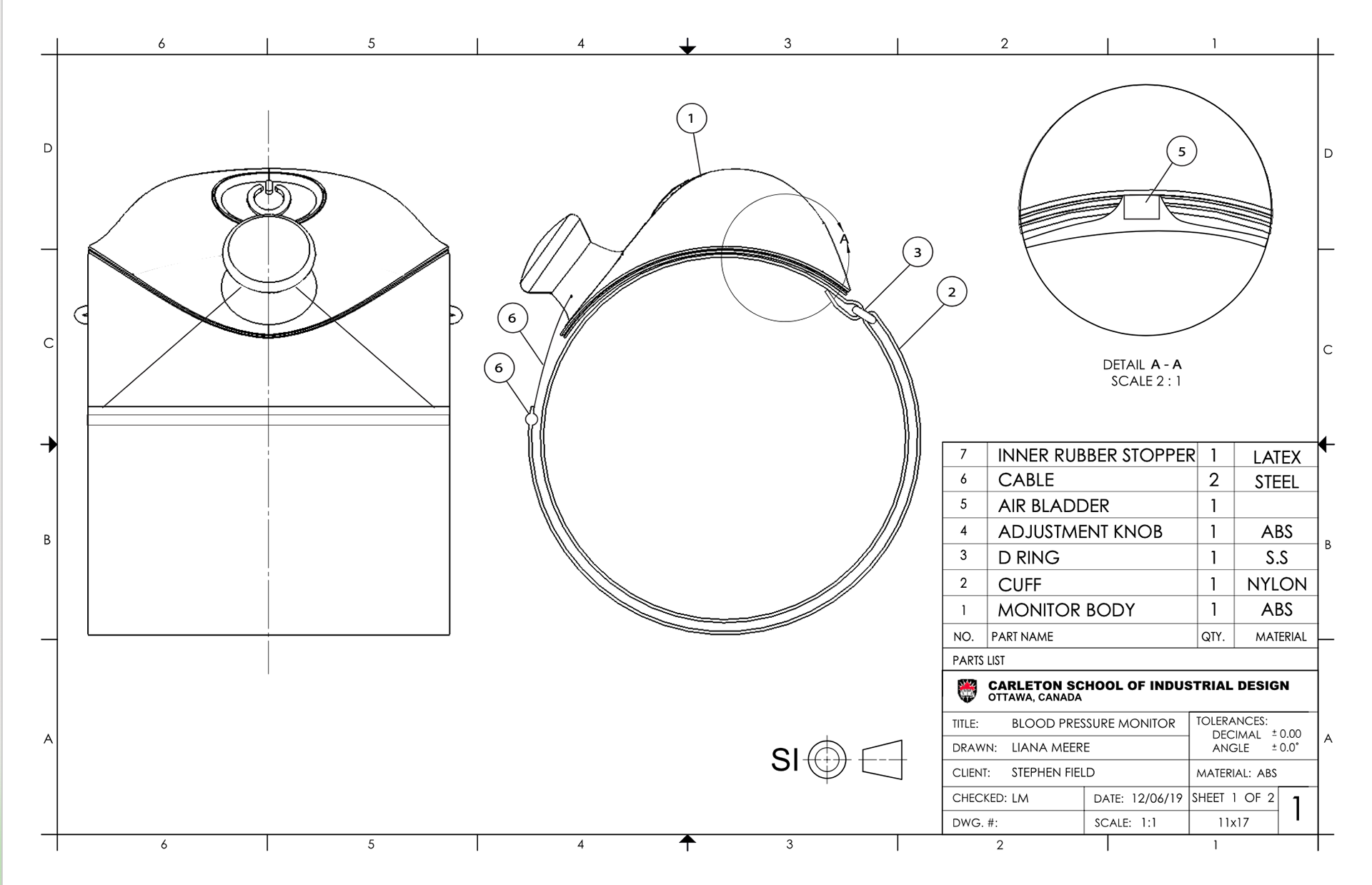
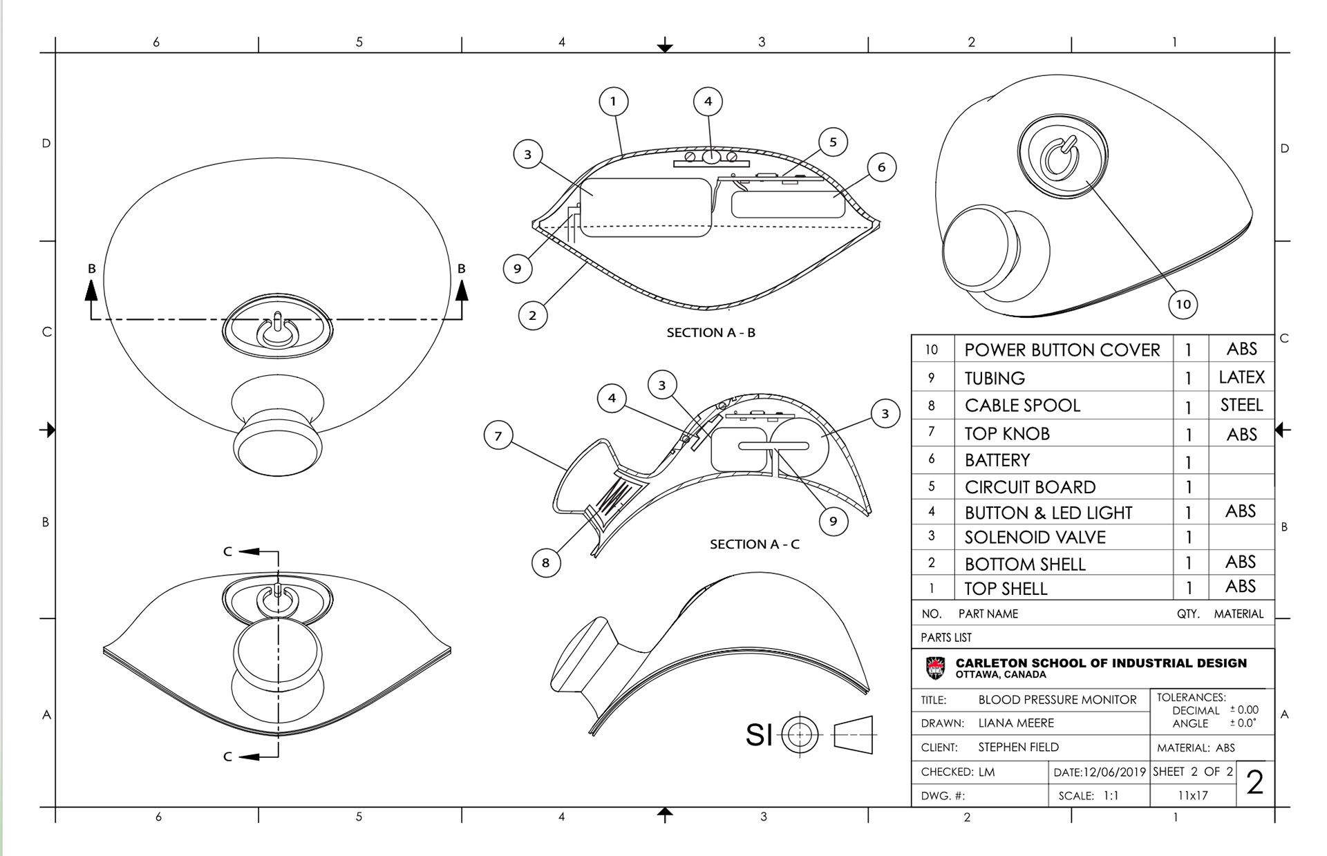
Because I decided to go without a screen, the only button I incorporated is one to turn the device in order to pair it with the user’s phone. A knob similar to the Boa lace knob would control the adjustment size of the cuff.
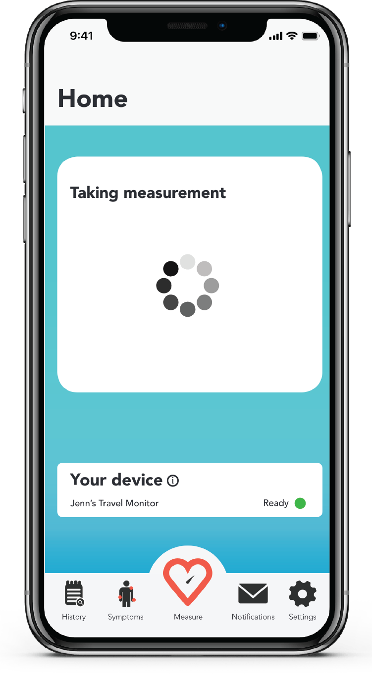
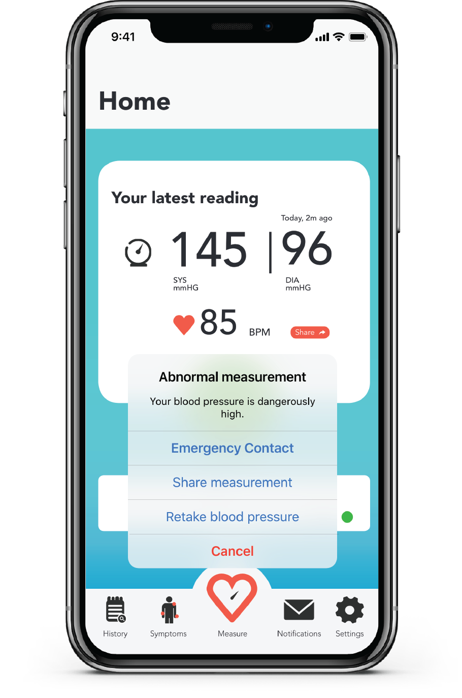
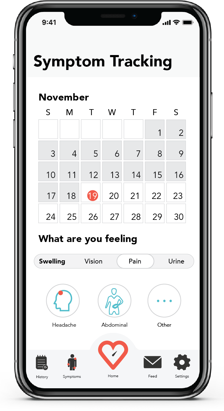
When a concerning reading is detected, the user's phone alerts them and offers a variety of sharing options. The app also allows the user to track various symptoms of preeclampsia such as bodily swelling.
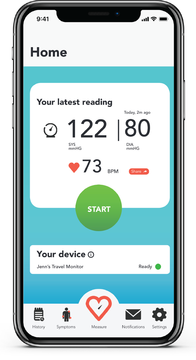
Home page
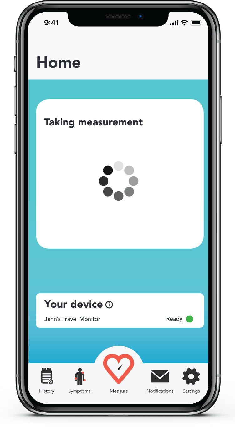
Loading page
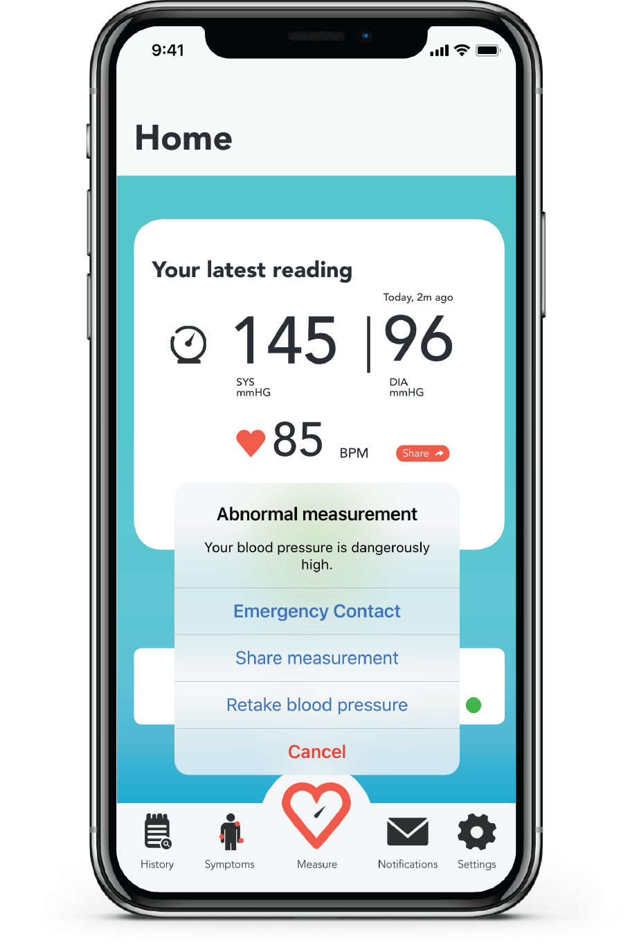
Alert and contact options
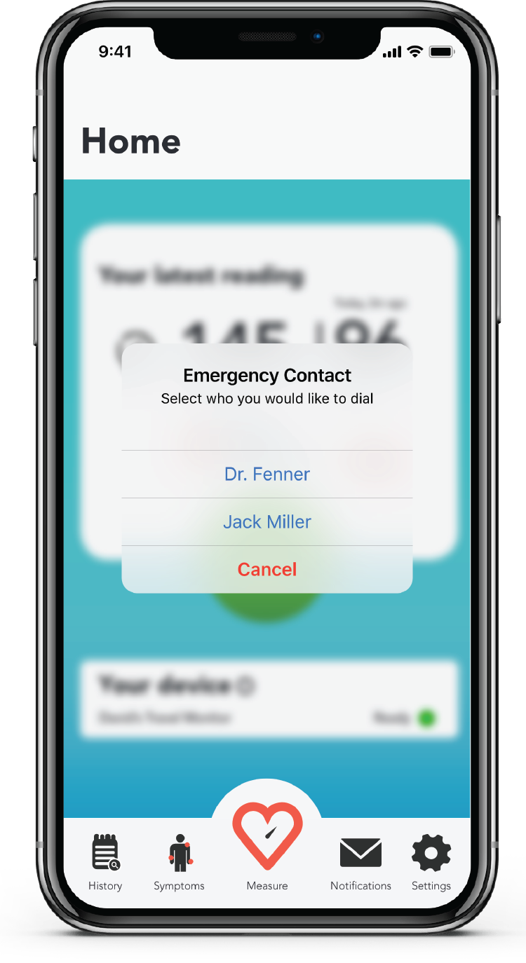
Contact selection
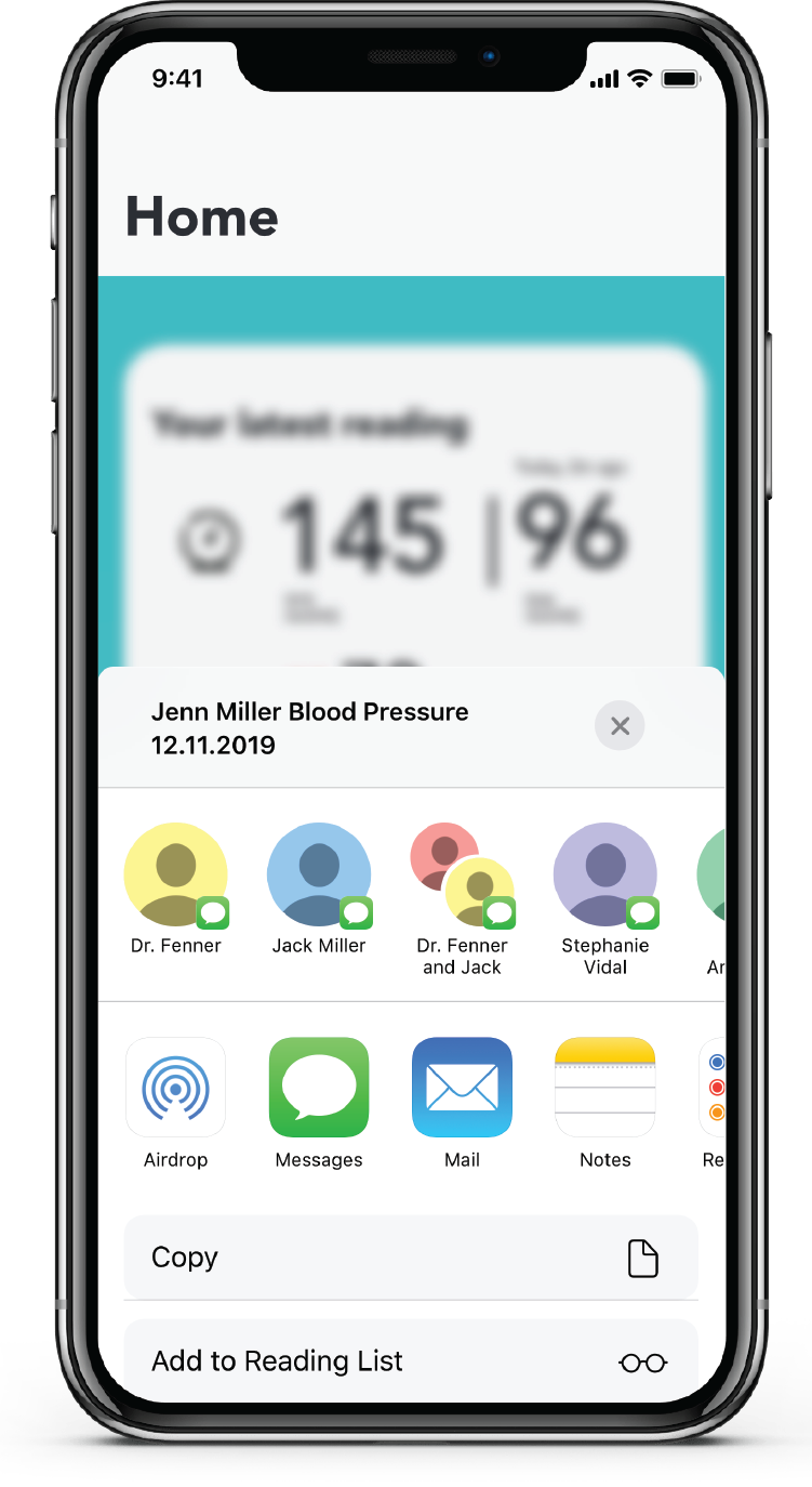
Share selection
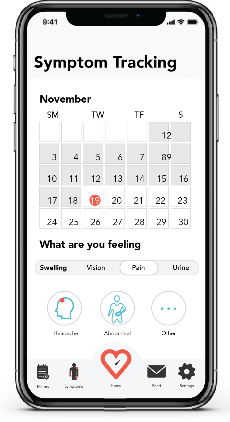
Symptom tracking page
Redeveloping the Form
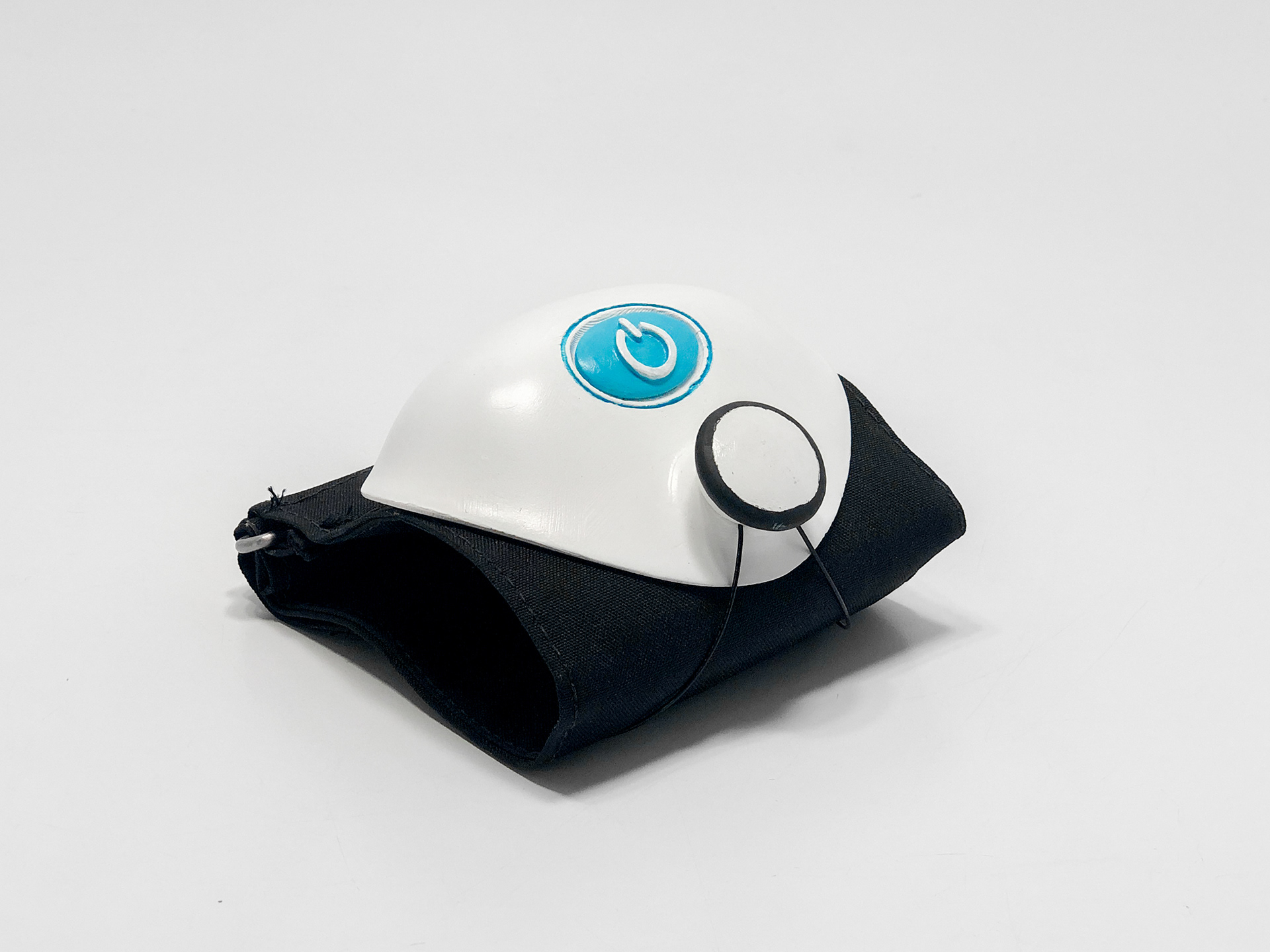
I realized I hadn’t taken full advantage of the fact that my monitor did not have a screen. After looking at so many photos of other blood pressure monitors with flat faces and angular shapes, I realized I had done the same thing. But without the screen, I was able to streamline my product.
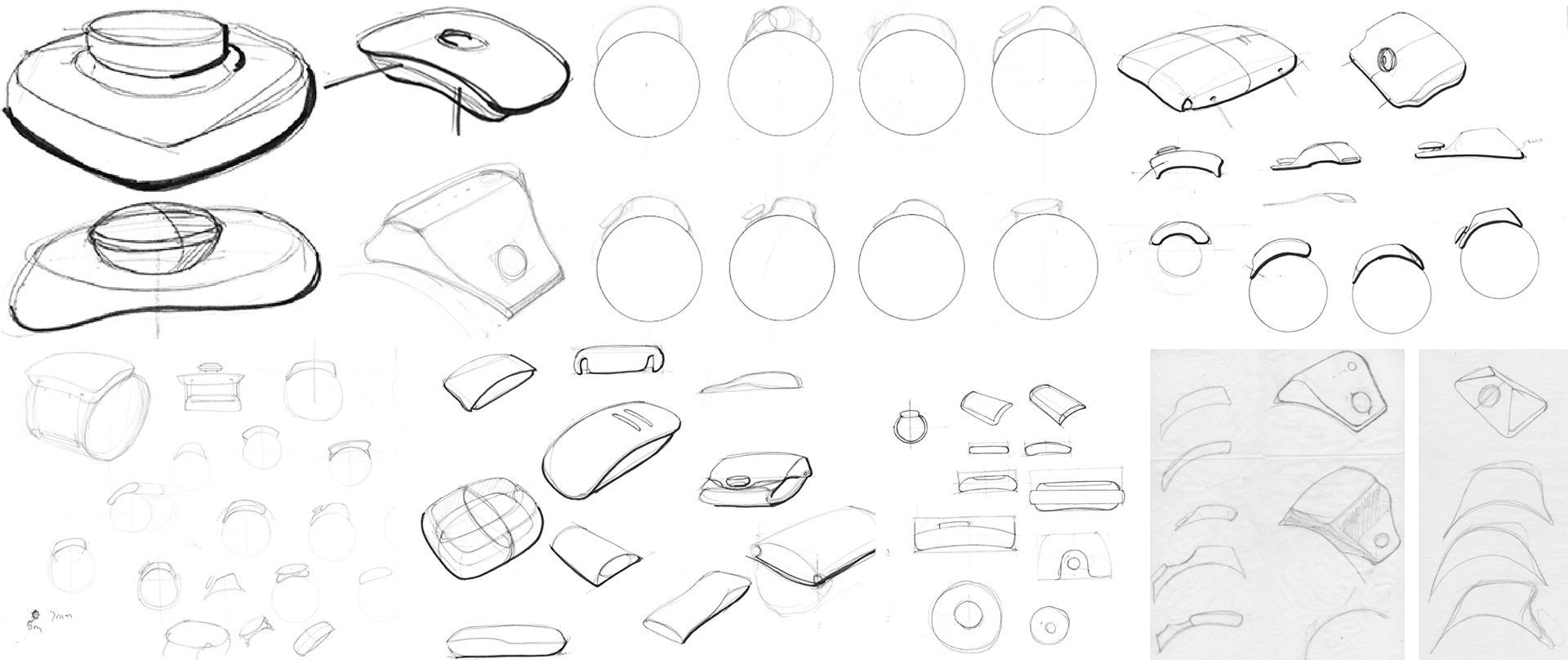
Form development sketches
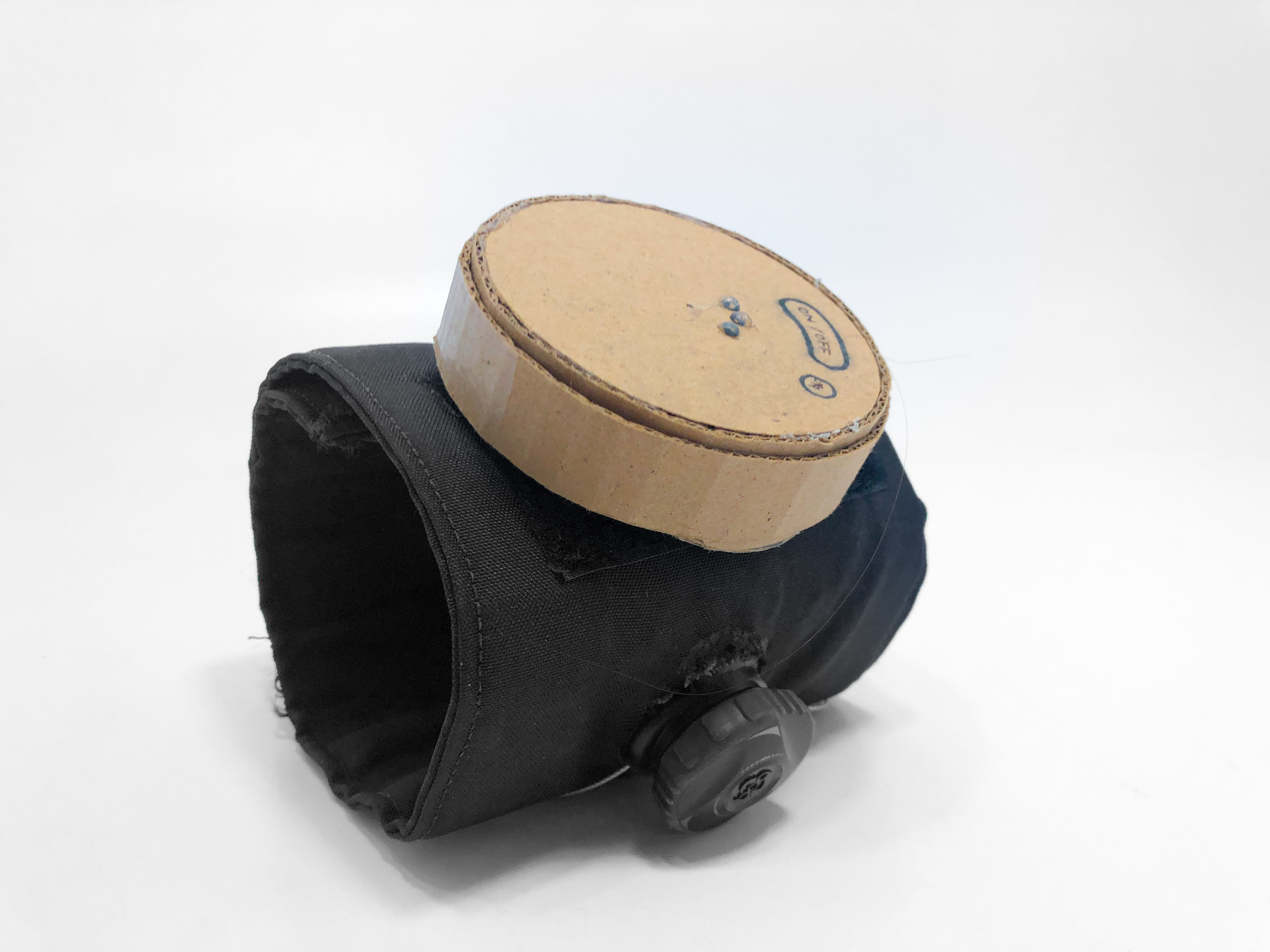
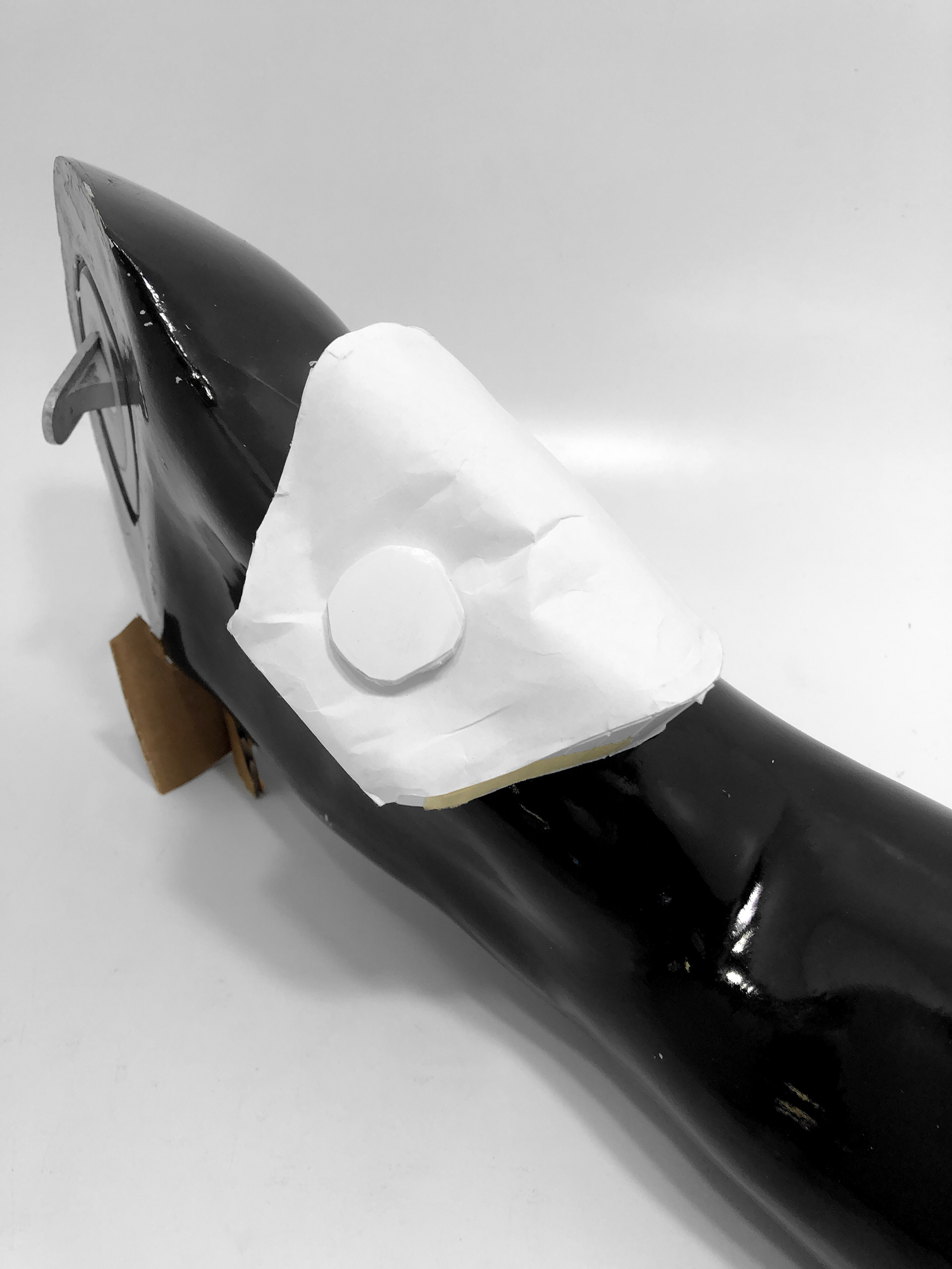
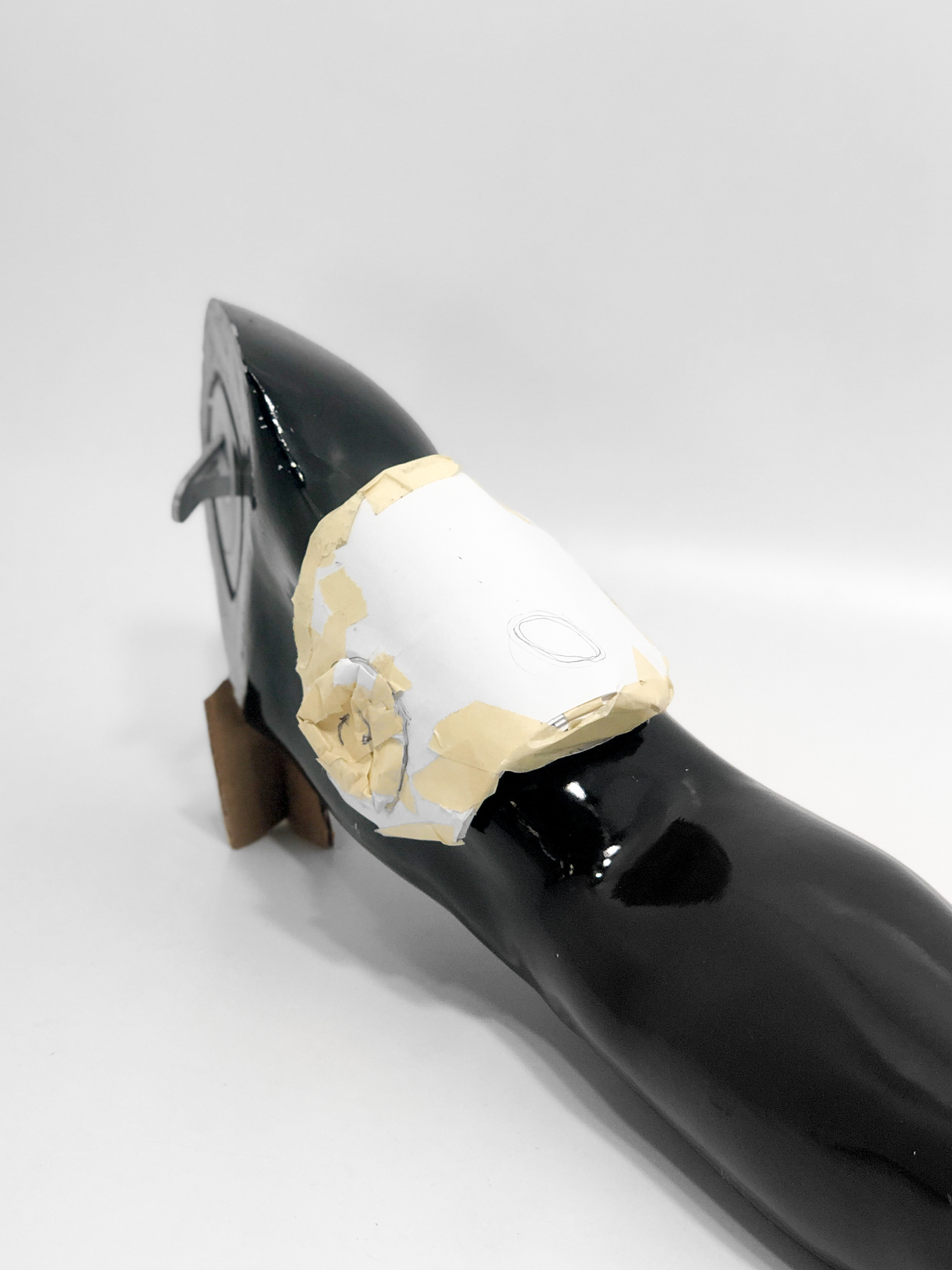
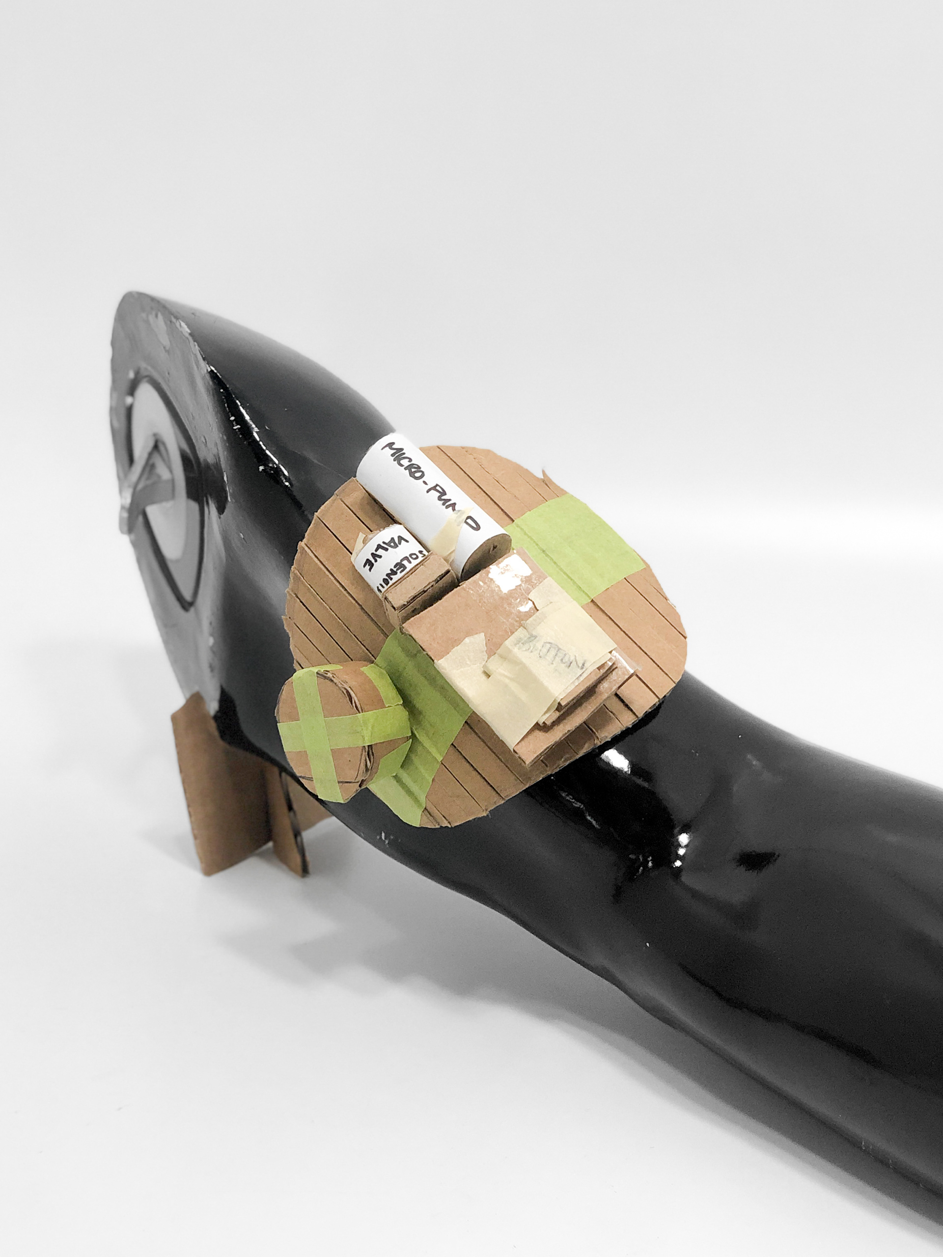
Internal components for sizing
The Final Concept
By overhauling the appearance, my concept evolved to be more visually appealing and forward thinking. The ring around the the button would light up when the machine is on and blinks when trying to pair the device to a phone. The app interface was changed visually but kept the same function and flow as my earlier concepts.
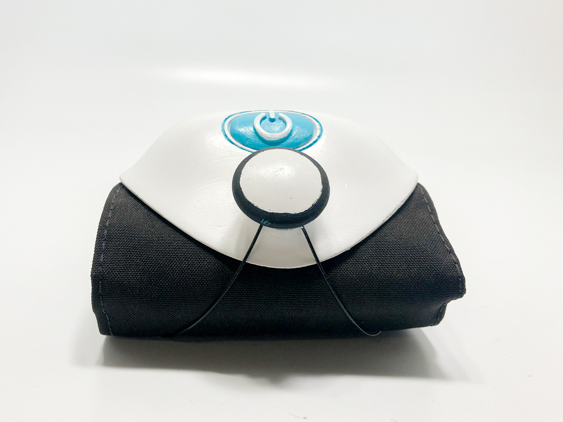
Final model (front)
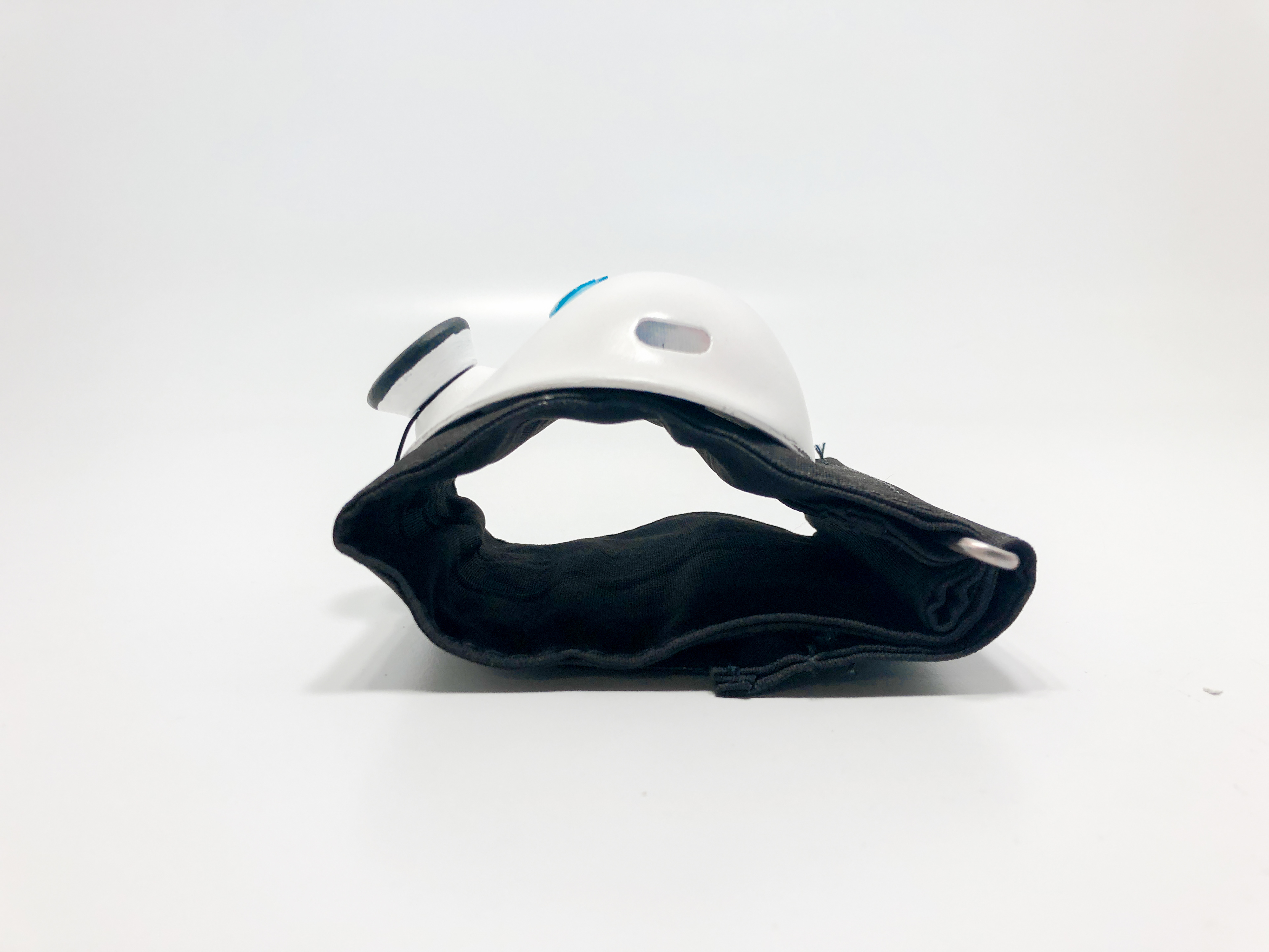
Final model (side)
Conclusion
The most impactful takeaway from the blood pressure monitor is the need to for purposeful design. Design should persevere in delivering what people need in order to care for their health and well being.